Color Blocks
| July 16, 2020The fundamentals of color in interior design

C
olor choices in interior design can seem overwhelming, but with rudimentary knowledge they don’t have to be. Our choices can reflect our personalities: if you’re a vibrant and eclectic person, you may choose to go bold, whereas if you have a more subdued personality, you may want neutral. Also, consider the feel you want in each space. Think about the time of day you’ll most often be in it, as well as its purpose — this will help dictate the environment.
Bearing these foundational concepts in mind, here are some pointers on making color selections for your home.
Misconceptions in Color
Myth: Dark colors shrink a space.
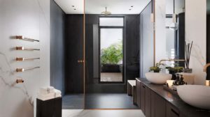
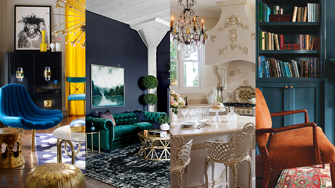
If you like an edgy look, don’t be afraid to go bold! Color and design expert Sharon Grech of Benjamin Moore says, “Dark wall colors tend to blur the edges of a room, which can make a space 
Implementation Ideas
1. When doing a dark paint color, use a lacquered finish to create some translucency.
2. Mirror and glass decor elements are good tools to create openness in a dark space.
3. Natural lighting from windows or skylights is always a plus. (If you don’t have natural light, you can always designate dark paint for a room that isn’t used very often.)
Myth: Ceilings need white paint. A ceiling can be in many colors besides white. View it as
your fifth wall!
Beyond the Paintbrush
An easy way to add color to your space is through accessories, which require little commitment and can always be switched around. 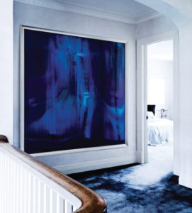
Implementation Ideas
1. A simple item such as a throw pillow or blanket can add a pop of color to a neutral sitting area or bed. Home-Goods, Target, Ikea, and West Elm are good sources for budget-friendly pieces.
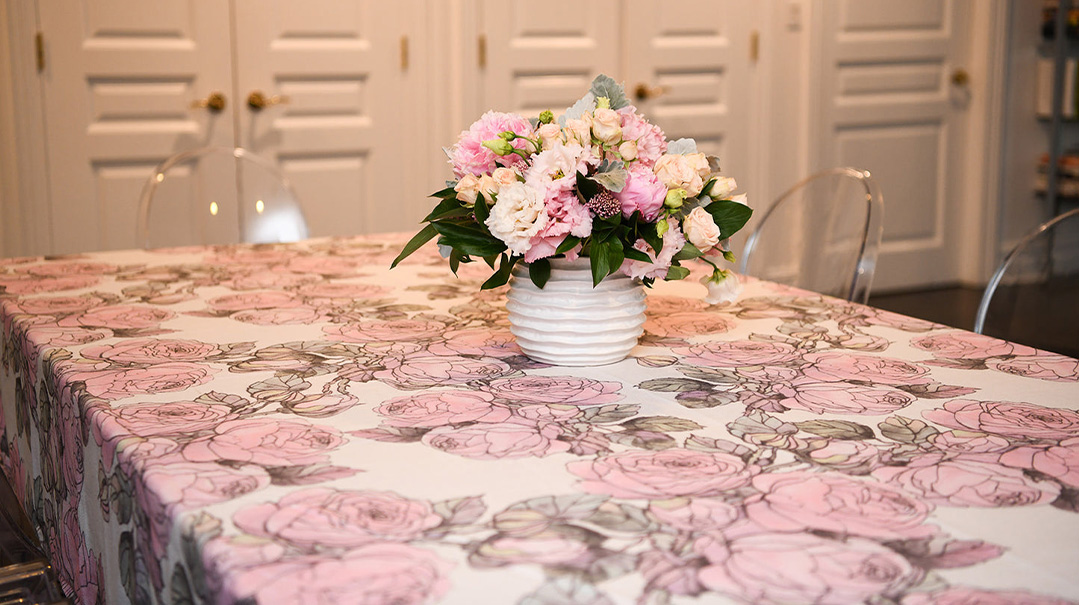
2. Fresh flowers add a beautiful touch. When they start to die, take the last few good ones and place them in a bud vase. Ikea and CB2 are great sources for decorative and budget-friendly vases.
3. Artwork is a great way to add color to a room that may be lacking.
Note: It’s very important to pick up one of the base colors from your space, like the color from your flooring. This image uses simple walls + trim + colored carpet + large statement art piece to tie everything together (see image to the right).
Placement Strategy
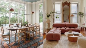
In general, a home should have a flow to the design, with seamless transitions from room to room. This doesn’t mean that every room has to be the same color, though. You can have the same few base colors in every room, so the house has an overall cohesive feel.
Implementation Ideas
1. Focal point or statement selection: Making one item act as a singular statement to the room allows it to be the room’s main source of color without distraction. This color can then be matched in neighboring rooms.
2. Like ceilings, trim doesn’t have to be painted white. You can use it to create a new design element to a space.
3. Bookshelves and wall units are a great space to add color. Simply paint or even wallpaper the wall that they’re on for a fun peekaboo effect.
Color Pairings
When choosing color in interior design, think of it like putting an outfit together — try things on to see how they work. Paint stores offer free swatches of all of their colors and paint samples can be bought for under $5.00.
Unlikely pairings are a great way to make a space more unique, and different colors that have the same root tones and level of brightness tend to work well together. Some color pairing examples that I like:
> Sea blue + lavender
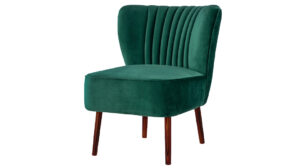
> Hunter green + burgundy
> Classic black + white
> Cognac brown + blush
Remember, selecting your color schemes begins and ends with who you are and what you want to reflect in your design!
Shana Horn-Steele is the founder and lead designer at Shana Horn Design, a national design firm with current projects in Miami, New York, and Chicago. Her past work includes upscale residential, commercial, and institutional clients. For more info, see www.shanahorn.com or follow shanahorndesign.
(Originally featured in Family Room, Issue 006)
Oops! We could not locate your form.

