Beyond the Welcome Mat
| January 8, 2020Your entry, regardless of size, is the first thing guests see when they enter your home. Turning it into a space you love will suffuse your whole home with that same warm and welcoming feeling.
A
s a designer who has clients all over the Tristate area and beyond, I’mused to working with a wide range of home sizes, each with their own unique layout. Since the vestibule or entryway is the first room you encounter when entering a home, it can sometimes require a whole lot of creativity, especially where size is limited. Here are my top tips to make your vestibule the best it can be.
Manage Your Expectations
A lot has changed since I started working as a designer. Years ago, I used to get hired by a client, then go to a newsstand and purchase actual paper magazines, give them to the client, and ask them to tear out the images that they loved or were inspired by. We would look them over, consider the size of the client’s home, and find a direction that worked for them. Today, clients preempt a consultation by scrolling through social media or Pinterest and saving a hundred images that they absolutely love, all with completely different styles and featuring unrealistic budgets. Sometimes too much information is not the best thing, especially for homeowners who aren’t so decisive! Remember that the “dream home” you see on your screen is usually not practical, realistic, or affordable, and it might not even be your taste. You can still look through social media for inspiration, but always keep in mind that you need to be realistic about your budget and space.
Work with Your Small Space
Tile I find tile is the most important way to make a space “grow.” If you add a border tile in a small vestibule, you’re defining the size and deliberately calling attention to how limited it is. Try a mosaic or a large profile tile to make your square footage look larger. If you really want a border, use a light-colored border that will define the space but make the size less obvious.
Mirror
If you have closets in a small entry, adding mirrored or glass panels to the exterior of the doors will create the illusion of space. If there are no closets, a decorative mirror does a great job of giving the impression of a window, making the vestibule feel airier than it is.
Lighting
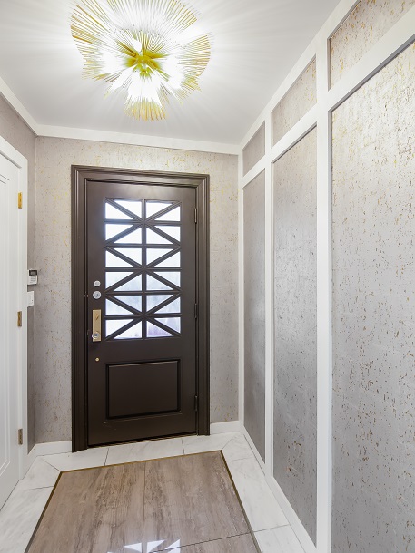
For low-ceilinged rooms, flush mount or semi-flush fixtures don’t invade the overhead space of your entryway, helping to maximize the ceiling space. If you really want a fixture, opt for something transparent like glass or crystal, so you can get an open feeling. That doesn’t mean there’s no time and place for a regular chandelier. There’s no one-size-fits-all solution with lighting; if you’re unsure what your space needs, your designer should help you with options.
Walls/ceiling
Go with lighter walls to make your space feel larger. Adding a little texture can also do some amazing things. Texture doesn’t have to mean color: for one client with a very small entry, we panelled the walls horizontally and painted them white fora crisp look that didn’t feel cramped. If your vestibule is a nice-sized space, however, you can have a darker wall for a cozy feel. If your budget allows it, adding a high gloss finish to your ceiling like venetian plaster will also open up your space. Shy away from shortcuts for this trick, like using high-gloss paint finish on normal paint, which can highlight any imperfections in your ceiling and cause more harm than good.
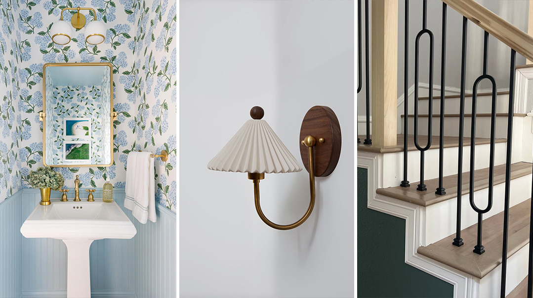
A little texture from wallpaper or paneling adds subtle character and a whole lot of warmth.
Work with Your Large Space
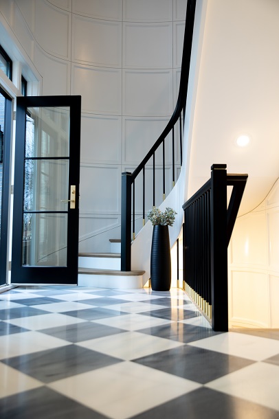
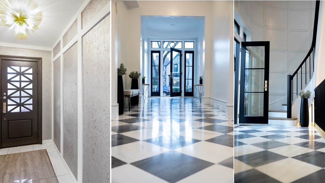
Bigger is not always better! Before you get carried away scrolling through Pinterest-perfect mansions, consider this: large entryways also have their challenges. It can be difficult to make a large entryway feel homey and not cavernous. Tile layout can help; in this case, it can be helpful to define the space with a border or pattern. A large checkerboard pattern with no border can also make a big space feel cozy while still allowing it to be large. Another great option is to add paneling to the walls to give them a warmer feel or to add contrast. In one client’s house where the large open entry and center hall was lacking definition, we kept the walls light, but the doors and windows trimmed in black, in order to help contain the space.
Work around Mistakes
Work with a Designer You Like
More than anything else, find the right designer for you. It really needs to be a good shidduch. If you feel confident working together and enjoy the process, your designing will be a much smoother experience.
Chavie Alter is a residential interior designer from Brooklyn with 12 years of experience. She works primarily in the Tristate area but ha sclients all over the US. She is known for her attention to detail, her positive attitude, and her meticulous aesthetic.
(Originally featured in Family Room, Issue 001)
Oops! We could not locate your form.
