Accessorize your palette
| July 15, 2020Choosing a palette beyond societal instinct, when executed with care, can produce a product that feels just as soothing as beige and white.
I
n my early design years, client meetings were quick and efficient. A scheme meeting would begin with a swatch book of paints, often accompanied by inspiration images. The speed of these meetings directly correlated to the repetition of the color schemes I was asked to match. There were colors in my book whose corners had begun to curl due to the frequency with which they were selected — soothing colors, neutral colors, bold accents in rich navy and grounding charcoal, repeat, repeat — “a classic.” Little by little, with these clone-like projects, the vibrancy that accompanies creative output would lessen, as I began to feel like I was working on autopilot.
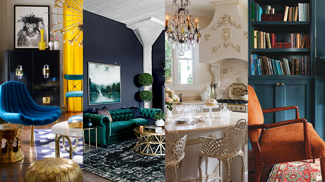
Are there classics? For sure. Is neutral a color scheme that is likely a first choice? One hundred percent. Are there sure-fire successful palettes? No doubt. But consider this: within shades of taupe and greige and white-with-blue-undertones-and-green-overtones-and-squint-one-eye-and-you-see-some-pink lies feminine lavender, rich oxblood, cardroom green, and bold plum. A soft blue in place of stark white adds a sophisticated layer that may not have occurred to you, yet reads calming; springy green drapes could pair wonderfully there, perhaps replacing that wheat-colored weave.
That room that was “fresh white with a pop of color” might be impactful, instead, if it were based around shades featuring said “pop of color.” What if that small pop was the white? What if neutral became a supporting actor and no longer the protagonist?
The risk lies in the execution, not in the choice to color outside the lines. Choosing a palette beyond societal instinct, when executed with care, can produce a product that feels just as soothing as beige and white. That comfort zone is a wonderful place to sit — but an even greater respite is found in thinking with a different, and wider, lens. Undoubtedly, that creative stretch yields a far more rewarding result.
How about trying one circumstance where we use our comfort zones as confidence-boosting placeholders for the fresh choices we can make?
Try it out and let me know how it lands with you.
Rivki Rabinowitz
Editor, Family Room
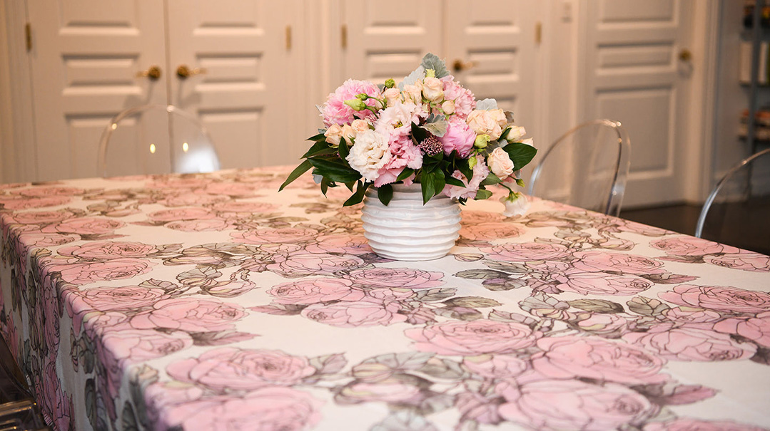
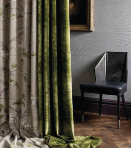
Can we collectively lose pattern phobia? This fabric would shine as drapes in a room with muted tonal values and warm woods.
DARNLEY: CHAMBALON TRAIL
$136/metre, archiexpo.com
I see these cards as a DIY art: fastened equidistant on a canvas, a thin frame — edgy and uniquely yours.
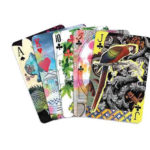
MAISON DE JEU PLAYING CARDS
$40, rockettstgeorge.co.uk
A vintage vanity repainted this color and topped in natural stone with a beveled edge, would shine in a room of honeyed neutrals. For the best selection and guidance, check out Ace Corner Hardware in Brooklyn.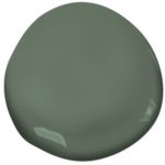
CUSHING GREEN
$10.99/pint, benjaminmoore.com
Colors can elicit emotion — but saturated hues are not the only way to achieve that. Here, texture achieves a similar psychological response.
LIBBY KLEIN ART

917-881-4633
(Originally featured in Family Room, Issue 006)
Oops! We could not locate your form.

