Stage 3: A Logo Is Worth 1,000 Words
| August 10, 2021Summing up the entire package in a single graphic is, without a question, incredibly challenging
Choosing a Logo
Calmin’ Ground’s next step was finding a visual that captured the essence of their business in a single glance
A Logo Is Worth 1,000 Words
Recap
Having homed in on their vision for their business, Yossi and Leah Lowenstein were ready to shed their former identity as Dr. Suss Stables. It was time to saddle up as Calmin’ Ground, an oasis of tranquility with universal appeal, and continue their trail ride with Branding Together’s dream team.
Branding/Logo
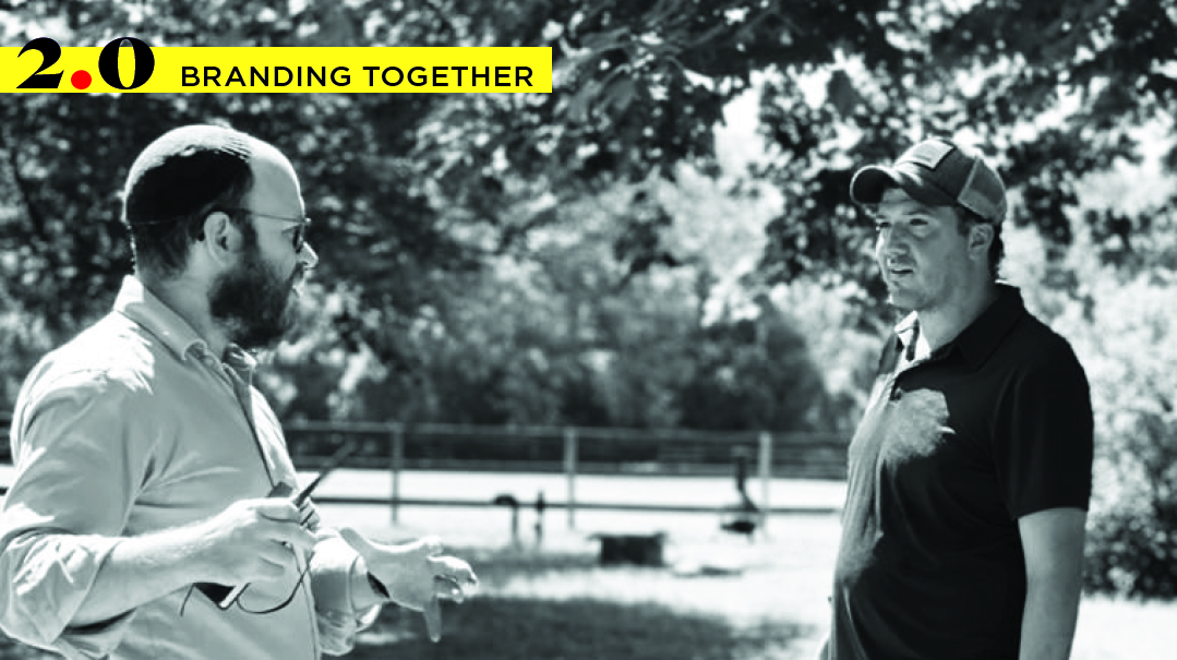
Featuring Yossi Belkin
Ready to face the world with a new identity that captured who they are and what they do, Calmin’ Ground was about to take its next giant step on its Branding Together journey — choosing a logo whose visuals would capture the essence of their business with just a single glance.
You can spend hours talking about the many facets of a business, discussing marketing strategies, sales goals, promotional ideas, and visions for future growth, but summing up the entire package in a single graphic is, without a question, incredibly challenging.
Next on the agenda for Calmin’ Ground was creating a logo. Over the years, founder of the Alenis Group and Branding Together team leader Elisheva Perlman has had to sit many a client down and explain to them exactly what a logo is and what it does and doesn’t do.
“A logo is a visual representation of a business name, but it isn’t a company and it isn’t a brand,” explains Elisheva.
Understanding your brand involves more than a little introspection, notes Elisheva. She guides clients through the process by having them visualize their brand as their partner on a lunch date. What would their brand order? How would it dress? Elisheva has found this kind of imagery to be a useful tool in better understanding a business’s vibe as well as its target audience. Then, once a business owner has spent the time configuring who they are and who they aren’t, they’re ready to design a logo that truly captures the company.
“I’ve seen companies who don’t spend the time defining themselves jumping in and printing awnings and bags, and designing their store around a logo they created online or that their sister-in-law did for them. One day they wake up and realize that it just isn’t working,” says Elisheva. “Your branding is going to last for a long time and it will distinguish you. A logo isn’t just a logo — so many decisions like your ads, your website, your store’s interior, and your packaging fall back on this. It really is a big, big part of the business.”
Elisheva finds mood boards to be a great tool for business owners to get a firm grasp of their company’s identity. She advises combing the Internet for images and concepts that resonate and pinning them to the collage. Often a common theme emerges that can offer insight into a brand. The Anelis Group utilizes mood boards at the outset of every creative campaign, drawing on them for the creation of a business’s logo, advertising, website and more.
Consistency is another biggie, and Elisheva advises business owners to match their fonts, tones, aesthetics, and colors to their company’s personalities, and to use them to build a reputation and boost recognition.
“Part of branding is considering every little detail,” explains Elisheva. “What does your bag or box look like? Is there a note or a card that comes with every package and, if so, is the wording sweet, funny or classy? What message does a customer receive after placing an order? What does the person who answers the phone sound like and how do they talk to the customers? Each one of these things needs to be consistent and can tell a brand’s story even if the business owner can’t afford to do a proper brand discovery.”
While business owners might think of marketing as a luxury, Elisheva believes it to be an integral part of the start-up process, and something that should be incorporated into every business plan. All too often she has seen companies that were haunted in the long run by not having put in the time and effort to build their brand from the bottom up.
“Let’s say a person launches a line of children’s clothing and invests in the product, the factory, the sales, and everything else, but their sales just aren’t what they hoped they would be,” says Elisheva. “After a while they might shut down, thinking that their product was a bad idea, but that isn’t necessarily the case — it may very likely be that it wasn’t branded well and people either didn’t know about it or didn’t perceive it to be something that was ‘on brand’ to them, so they chose another practically identical item that had better branding.”
Elisheva is also a big fan of subtlety in logos, citing the barely noticeable arrow between the “e” and the “x” in the FedEx logo and an embedded 31 in the Baskin Robbins logo, a nod to the ice creamery’s flavor count.
One of her all-time favorites is Apple’s iconic design featuring its namesake fruit. There were no creative briefs or lengthy planning sessions when Steve Jobs asked graphic designer Rob Janoff to create a logo for the fledgling computer company’s first personal computer, the Apple II, telling him only “whatever you do, don’t make it cute.”
Janoff returned to Jobs with a single design: a rainbow-striped apple, with one bite missing to ensure that the logo looked very much like an apple, and not some other round fruit. Janoff’s rainbow apple was an instant hit, and while its colors have transformed several times since its creation in 1977, the iconic shape has stayed the same.
“You would think that for a company like Apple they would have gone through hundreds of versions, but the designer was so sure that this was the way to go that he produced only one version,” observes Elisheva. She often tells creatives, “Your client hired you for your skill and your expertise. When you utilize that skill and trust it, your best work emerges.”
Having grown up in a home that was equipped with all the latest in technology, Yossi was already entranced by Photoshop by the time he hit bar mitzvah, spending his spare time dabbling in graphic design, a passion that he ultimately grew into a fulltime business.
His talent caught notice of creative directors and won him assignments for prestigious corporations including AT&T and Kodak, and he began specializing in identity work, focusing on building brands for higher-end businesses. His logos have graced products and entities that run the full gamut, including a line of hard kombucha products, a private jet company, a Seattle-based sneaker firm, and a commercial real estate shop in Chicago.
Yossi believes that creating a distinctive mark is hugely important for a fashion line, because it can potentially be appearing on shirts, bags, tags, labels and actual products. Other businesses, such as those that sell cleaning products or wholesale items, may not lend themselves to same type of logo and may be better served by creating a design that shows their name in a simple, modern font.
“You want something that is iconic and memorable without being too complicated or complex while still aesthetically pleasing,” observes Yossi, who readily admits that a logo alone isn’t enough to carry a business’s marketing. “A logo has to work well with the colors, fonts, copy, website, photography and business cards — all of the things that bring a brand together. You can have a nice logo, but if your website or business card isn’t well designed, all of a sudden that nice logo doesn’t look so nice anymore.”
Yossi’s logos are typically concepts that are born on paper before they make their way onto his computer. Conversations with the client and/or their creative director to understand the brand’s vision and identity are essential, as are discussions of what styles visually appeal to them and their target audience. After that, Yossi will offer suggestions that may or may not resonate with the client.
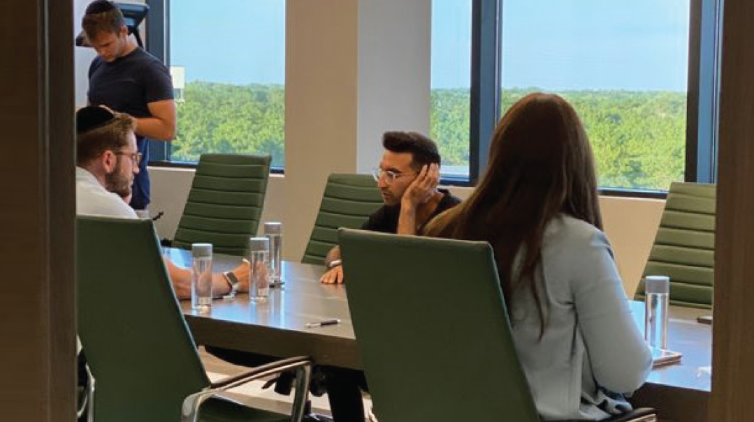
In the case of Calmin’ Ground, after sitting in on Zoom conferences and hearing about the farm and what the Lowensteins were trying to accomplish, Yossi and Elisheva started brainstorming possible ideas for a potential logo.
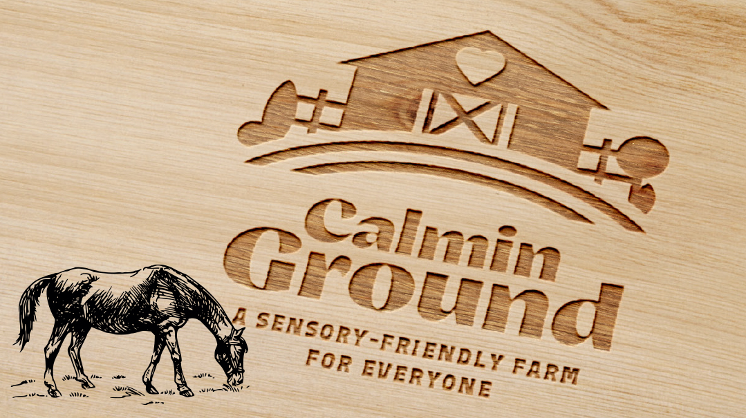
“Elisheva started sharing photos of the farm with me, and right away I started to picture love, warmth and comfort in my head,” recalls Yossi, remembering how a large barn situated at the front of the property immediately caught his eye. “It had this pitched roof with dead space right in the middle and my first thought was that was where the logo should be. But then as I was looking at it, I realized that the barn wasn’t where the logo should be — the barn was exactly what the logo should be.”
At Elisheva’s suggestion, Yossi replaced the typical circular barn window with a heart, bringing to life the love, hospitality, and common connections that are essential components of the Calmin’ Ground experience in a color palette that suggested warmth and nature. Elisheva and Yossi went through several rounds of tweaking before they came up with a logo that Elisheva felt confident presenting to the Lowensteins. “I try to create something that has a little bit of an ‘aha’ moment, and I think we really achieved that with Calmin’ Ground,” Yossi says.
Even with years of experience, Yossi still finds that there are moments when the ideas just aren’t coming. He finds that taking a break can be hugely beneficial, whether working on something else, going outside, or sitting down and playing with his kids. Of course, there are still the inevitable times when clients are envisioning a mind-blowing design totally not in keeping with who they are and what their business is all about. “Oftentimes, their brand doesn’t lend themselves to that,” says Yossi.
Take your brand out to lunch!
Understanding your brand involves more than a little introspection, notes Elisheva Perlman, creative director of the Anelis Group and Branding Together team leader. She guides clients through the process by having them visualize their brand as their partner on a lunch date.
- What is your brand wearing?
- What kind of music is it listening to?
- What is it doing while waiting for its order to arrive?
- Is your brand ordering an avocado toast on sourdough, or a pastrami sandwich with pickles and coleslaw? A gluten free muffin packaged in recycled earth friendly containers? A rare Delmonico steak accompanied by Cabernet Sauvignon?
- Would it carry a spiral notebook with a Bic pen or would it show up to a meeting wearing AirPods?
Elisheva has found this kind of imagery to be one of the numerous useful tools her team uses to better understand a business’s vibe as well as its target audience. Then, once a business owner has spent the time configuring who they are and who they aren’t, they’re ready to design a logo that can now visually capture that message.
Branding Basics
As you develop the branding for your company, keep in mind some of these tips that Elisheva shares with her own clients.
- A logo is a visual representation of a business name, but it isn’t a company and it isn’t a brand.
- Your branding is going to last for a long time and it will distinguish you. A logo isn’t just a logo — so many decisions like your ads, your website, your store’s interior, and your packaging fall back on this. It really is a big, big part of the business.
- Mood boards are a great tool for business owners to get a firm grasp of their company’s identity. Try combing the Internet for images and concepts that resonate and pinning them to the collage. Often a common theme emerges that can offer insight into a brand.
- Consistency is key! Match your fonts, tones, aesthetics, and colors all across the board. The goal is that if someone can block your company name from an ad or website, your branding would still be recognizable because of all the consistent details that are part of your brand story.
- Details make a huge difference. What does your bag or box look like? What message does a customer receive after placing an order? What does the person who answers the phone sound like and how do they talk to the customers? Each one of these elements needs to be consistent and can tell a brand’s story even if the business owner can’t afford to do a proper brand discovery.
- Marketing isn't a luxury. It’s an integral part of a business start-up process, and something that should be incorporated into every business plan.
- Fancy and elaborate branding and logos with illustrations and icons don’t mean better. You can have an incredible brand by having a simple, no-fuss design.
Our Take
Yossi and Leah Lowenstein were happy to exchange their old logo of a horse wearing a cowboy hat for the new Branding Together design.
“We love the logo,” says Yossi. “It incorporates the homey feel with the barn shape and it brings out the idea that we are trying to provide a sense of nature in a place where people get a sense of calm.”
The Lowensteins were also excited that their new logo conveyed a feeling of belonging, an integral component of the Calmin’ Ground experience.
“That sense of hominess really comes across,” said Yossi Lowenstein. “It really speaks to the idea that we have gotten to know so many families and how the kids who come here have gotten to know the horses and feel at home here. That sense of community is really at the heart of our operations and Yossi’s logo brings that out in a very big way.”
(Originally featured in Mishpacha, Issue 873)
Oops! We could not locate your form.
