The Primaries of Color
| July 15, 2020Educational Basics to Clarify Colors
Text by Leia Whitman Karoly
W
hen it comes to interiors, the devil’s in the details. In the home design process, it’s easy to get caught up in the big selections that have instinctive wow factor, but overlooking basic choices that feel unimportant is a mistake.
A fundamental example of this is paint. The colors chosen for your home are the anchor of your space. They are literally the canvas upon which you will tell your story, so let’s start at the beginning.
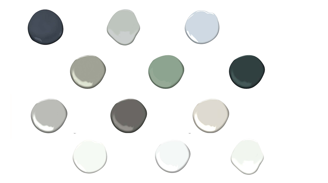
WHITES
No, all whites are not the same. However, there are industry standards that designers turn to repeatedly because they are that good. Dare I even call these the universal three? Think I might.


GRAYS
While I’ll admit that gray isn’t my first choice when it comes to palette selection, I respect the safety net that it offers.
Here are my top three grays:


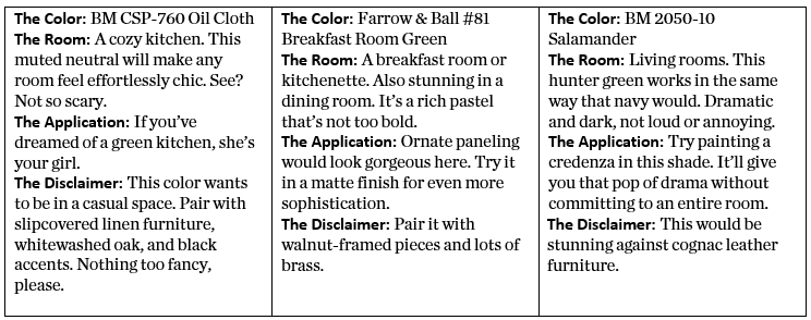
GREENS
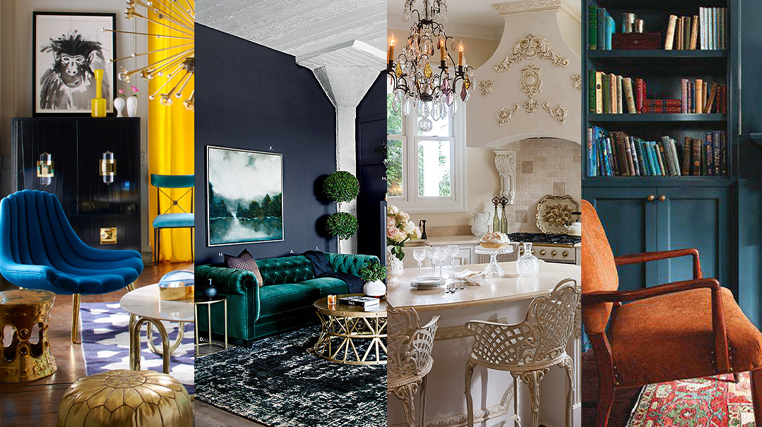
I appreciate that green might not read as chic to some at first, but my job is to push people out of their comfort zones. Green is one of nature’s neutrals, so while you may think It’s crazy to bring it inside, it won’t be as obvious as you might think. Hear me out, I’ll show you three:

BLUES
Blue is typically the first venture into the world of pigment for someone “scared of color.” Here are my picks to entice you out of your monochromatic shell:

Finish It Off
There are no right or wrong answers here. Designers have different opinions about what finishes they like, so don’t get confused about conflicting information. Here’s my take:
Flat: My go-to for ceilings because it won’t cast any weird shadows from your lighting.
Ultimatte: I love this for walls as it has zero sheen to it. However, if you’re worried about fingerprints, only use in rooms that don’t get much traffic, since it’s hard to clean.
Eggshell: The most popular choice for walls. It’s low maintenance and easy to clean. The low luster finish (like the surface of an egg) is shine free.
Semi-gloss: My go-to finish for trim-work. It also works well in damp areas. Easy to clean.
High gloss or lacquer: While these two are different, they’re used for the same purpose: to give one specific spot a standout moment. Beautiful on a study ceiling, or to wrap the walls of your dining room.
Enjoy Responsibly
Choosing paint is a process that requires thought. Here are some items on my checklist that I always run through before finalizing a paint schedule.
1. Does the code match the name? Painters don’t double check this and will only use one point of reference when ordering paint. There is nothing worse than walking into your newly painted house that was meant to be white but is now a highlighter hue of tangerine. Take it from someone who’s learned this the hard way.
2. Did I test the color in the space? Paint decks aren’t actually made from paint. Get a pint of the colors you’re considering and test two coats. Observe them in the morning and the evening.
3. Should the color be lightened? If there’s a color you love but think is too aggressive, lighten it by at least 50 percent. This will give the same feeling but muted.
4. Paint your trim and walls the same color. Nothing yells passé more than white baseboards and crown against gray walls. It cuts the space up unnecessarily.
Making It Your Own
I’m giving you a guide to some of my favorites, but that doesn’t mean another choice is wrong. Consider this a kickoff point to steer you in the direction of hues that speak to you.
Leia Whitman Karoly is the Principal Designer at Gowans Whitman Design Inc., a full-service interiors firm in Toronto. Having graduated from the New York School of Interior Design, Leia has eight years of design experience in New York and Toronto in high-end design, staging, and construction. Contact her at leia@gowanswhitman.com.
(Originally featured in Family Room, Issue 006)
Oops! We could not locate your form.

