Effortless Environments
| June 15, 2021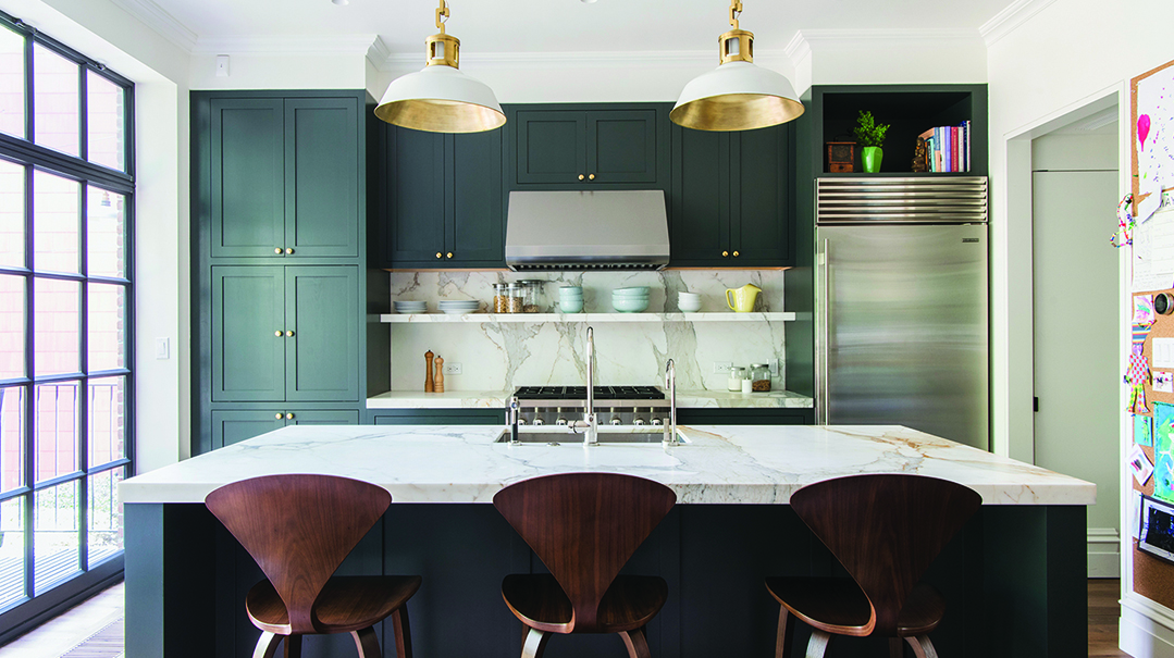
Cochranslumber.com
We’ve all seen those magnets that read, “Good moms have sticky floors, messy kitchens, and happy kids.” I may or may not be a good mom, but no doubt, I am a happier and more relaxed mommy when my house feels cleaner.
We are currently renovating our house, and my goal in designing it is a home that feels airy and bright, yet requires minimal daily maintenance to keep it looking clean and in good condition. I spoke to a few top designers for guidance on how to strike that balance and create an oasis that always feels welcoming. Here are their tips.
Natural Light
All the designers agreed that the lighting in your home makes the single biggest difference between a dreary house and a bright, airy one. Try to include as many windows as possible when renovating or building a home. For privacy, Penny Kraus, design associate at Susan Strauss Design, suggests adding semi-opaque sheer curtains.
Although the bigger the windows the better, cap your window height at door height for greater aesthetics. In addition, before you finalize a window plan, keep in mind your furniture layout and space for drapery. Floor-to-ceiling drapery brings the eye up, giving the illusion of taller ceilings.
The casing profile around the windows should be three to four inches wide max, says Tova Kook of TK Design, and you can even consider a more modern, cleaner look with no casing at all, just sheetrock.
Artificial Light
In addition to natural light, and certainly in lieu of it, make sure your ceilings are well lit, with lighting fixtures no more than five feet apart.
While we’re up here at the ceiling, paint them right for maximum light. Penny recommends Benjamin Moore OC-151, also known as PM2, with a flat finish for the airiest effect. If you have a highly competent painter, a satin finish on your walls is ideal because it gives a beautiful effect and is easier to clean. Otherwise, eggshell is your best bet. (See Family Room Issue 16, “Paint 101,” by Shiri Feldman, for a full rundown on paint finishes.)
For walls with paneling, make sure the proportions are correct; if the vertical rectangles are too short, the ceiling will appear lower.
Tova suggests painting your ceiling and moldings the same color as your walls to make the room feel larger. For best results, use 30 percent less pigment in your ceilings and paint them with a matte finish, and paint the moldings with a satin finish.
Flooring
Flooring is a big subject with loads of options, and from my informal research, it seems to be the source of people’s chief regret post-renovation. We all want floors that match the aesthetic of the house while at the same time hide crumbs, dirt, and water droplets: one tall order!
If you’re using tiles, the larger the tile, the grander the room feels, Penny and Tova concur. Yael Wiesner, interior designer and professional organizer, points out that larger tiles mean less grout lines to collect dirt. For porcelain tiles, honed, polished, or satin finishes are great options. Some subtle veining or variation in the design gives your floor a good chance of looking clean even when it’s not perfectly so.
If you prefer wood, rift white oak is a first choice among designers. Tova suggests staining them very lightly or even mixing white paint into the Nordic Seal. To keep wood floors looking great, Penny recommends a screen coat to cover scratches rather than a full sanding job.
Carpeting is one of those things people either love or hate. A compromise position is to add a rug to hardwood floors, since rugs are easier to switch out and offer a more luxurious look than wall-to-wall carpeting does, Penny notes. Viscose rugs don’t hold up to foot traffic or any moisture, like spills, so steer clear of those and opt for natural wool or wool blends. As a rule, the busier the pattern, the easier the upkeep.
If you prefer to stay away from rugs, Yael suggests softening up a room with curtains, throw pillows, flowers, and warm accessories.
Prevent the Clutter Buildup
Now that we’ve got the general floor-to-ceiling lowdown, here are a few more tips about those spaces in our homes that magically seem to get messy all by themselves.
Kitchen
Planning ahead and designing your kitchen for everyday function is highly effective in the long-term effort of keeping surfaces empty. A space planner or kitchen planner can help you execute this, even if you’re working with an existing kitchen.
As far as aesthetics, both quartz and quartzite work well for countertops. When possible, use a slab of the same material for the backsplash to create a clean and seamless feel. Yael notes that a glass backsplash also offers a very smooth and neat appearance. Consider buying appliances with a fingerprint-free stainless steel finish or matching cabinet panels so you have fewer surfaces to wipe down daily.
Living Spaces
For a room filled with furniture, such as a dining room or a living room, keep these pointers from Penny in mind:
* Furniture that’s bold in design but not ornate creates interest without adding heaviness. For example, place a sculptural statement bench against an empty wall with bold artwork above it to make it a feature wall.
* There should be a minimum 36-inch passageway around all furniture. Between sofas and coffee tables, you can manage with around 22 inches.
* Round tables offer more breathing space, and furniture with clean lines adds to the modern and airy feel of a space. (Tova notes that a pedestal table offers a less crowded look too.)
* Check the cleaning code and fabric content of your furniture before you make any purchases so you’ll know how to maintain it. There are plenty of options that offer beautiful textures while staying low maintenance.
(Note: See “Spring Clean” in this issue for more about fabric upkeep.)
Play Spaces
Playrooms should ideally have closets so all toys can be put away behind closed doors. Keeping closets to an 18-inch depth depth will ensure that they’re deep enough for boxes and bins of toys, but not too deep that they become a mess. If you use storage cubes for toys, use opaque containers with neat labels that state what belongs inside, along with a picture or graphic for the younger folk in your house.
And last but not least, if and when you have the opportunity to design your home, be confident and choose styles that you yourself like! Your house should make you happy and relaxed. “Relaxed” being a relative term, of course. Rest assured, I also have a kid throwing a tantrum, another hanging onto my skirt, and a frying pan starting to smoke as I’m rushing to get dinner going before my last round of carpool for the day (aside from the bigger picture stuff in life, of course).
Yet the home where my kids make memories and messes is precisely where my heart is. Having it airy and easily maintainable means that I can be more relaxed and give them my full heart without stressing as much about the endless cleanup.
To contact the designers quoted in this article, email Penny Kraus at penny@susanstraussdesign.com, Tova Kook at tova@tkdesignnyc.com, and Yael Wiesner at yaelwiesner@gmail.com.
Esti Vago is the US Production Manager for Mishpacha magazine. She also owns Plan It Home, a space-planning and renovation-consulting business, and coordinates craft designs and events for parties and camps.
(Originally featured in Family Room, Issue 017)
Oops! We could not locate your form.
