Colors in Nature
| May 18, 2021Lean into nature as we find color inspiration from every environment
Florals by Primrose Ny
Photography by Mod Schwalbe
When we think of design inspiration, don’t we initially jump to fabric shops, paint swatches, and magazine editorials? At least, I generally do.
But really, the inspiration is everywhere.
The concept for this shoot came from a cloudy day where a snapshot of the blue-gray sky was color matched and became the perfect shade for our hallway walls. If nature is the ultimate canvas, why are we limiting ourselves to conventionality? Inspiration is everywhere, is it not?
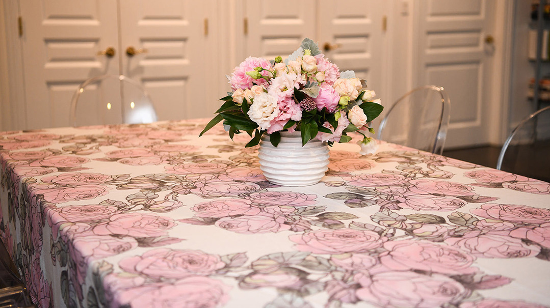
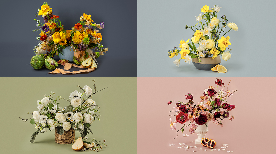
Here are four floral schemes, arrangements whose saturated and diverse colors act as the catalyst for entire room schemes. We’ve matched the paint colors to each bouquet, so feel free to snip and take each scheme to your local shop to test and try on your four walls.
Tip: Download the Color Portfolio app to match a photo to Benjamin Moore paints. While these were sourced in person for greatest accuracy, utilizing the app is a great start in the comfort of your own home.
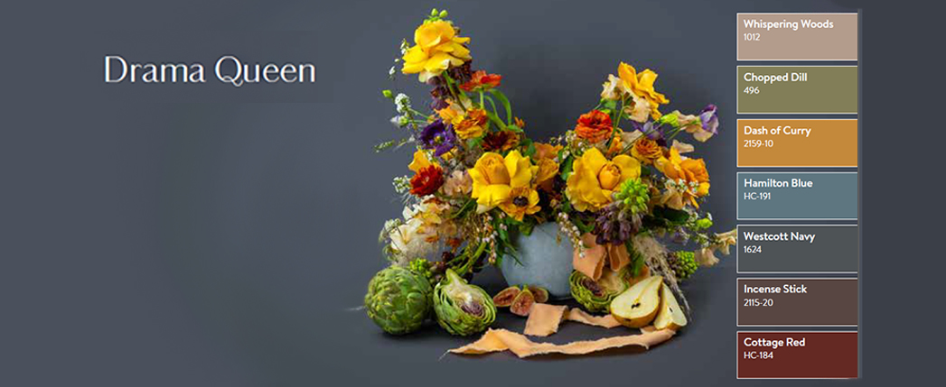
While at first glance, this moody scheme feels dramatic and somewhat formal, perfect in a dining room, these colors can be utilized in a number of different ways:
I see pink-taupe walls with a navy-gray washed cotton sofa with rolled arms. A linen armchair with a faint, small-scale mustard and blue pattern sits in the corner, and browns are carried throughout via pine and mahogany woods. A woven sisal rug trimmed in burgundy grounds the space.
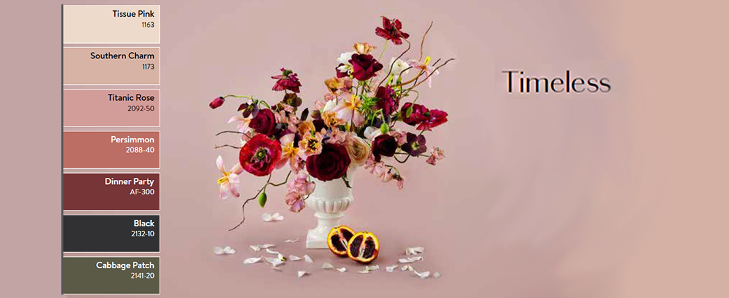
The pinks and burgundies here are feminine and sophisticated. They require depth in palette, like in colors black and green, so they don’t feel juvenile.
In this dining room, the walls are white with a pink undertone. A black dining table with a wrought-iron base is the anchor of the room, and heavy window treatments in a deep peach-blush velvet add formality. The frame of the dining chairs is classic; the fabric is olive green. A cream rug sits under the table with a very thin Greek key pattern around the border.
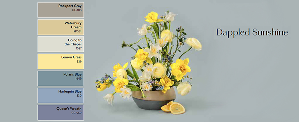
Light blue and yellow are reminiscent of a little boy’s scheme, but in this sunroom (work with me here; somehow this house has one), the feel is definitely not juvenile.
There is a paisley wallpaper in shades of blue, taupe, navy, cream, and yellow. It is sun-faded and well worn. There is a deep-stained wood bookshelf overflowing with paperbacks whose ends have curled from use, and a supremely tufted couch wraps the wall in taupe, with squishy pillows in marigold, dusty blue, and chocolate brown. The ceiling is painted warm white, and the beams are medium blue. A copper lantern hangs down the middle, and the side tables have petite wood table lamps, fitted with indigo pleated shades. Welcome.
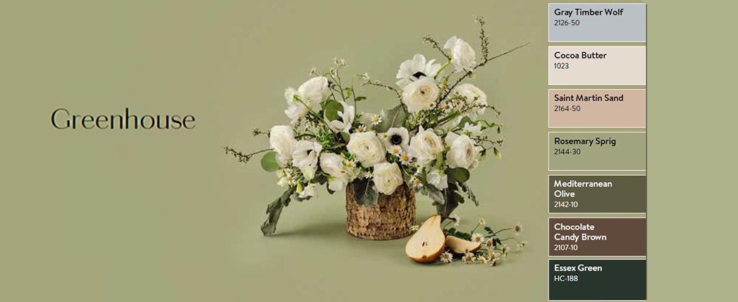
Sage green is trending now, but its inception is far from new. We love the idea of modernizing it with a geometric floor and burl wood accents.
This powder room is painted sage green, with a lacquered ceiling in light gray-blue, and there is a wood vanity with a white countertop. Matte sconces in peach plaster border a simple shadow-box black mirror, and the floor is a classic pattern, in hunter green and white. An oatmeal towel with olive fringe is folded. This room smells like sage and lemon, and I wonder if there are kids in this house?
(Originally featured in Family Room, Issue 016)
Oops! We could not locate your form.

