Shop Your Home
| September 29, 2021As a kollel wife living abroad, I would love to see an article highlighting ways to transform an apartment that needs some love, as our home is small, dimly lit, and moldy in some areas. Small, attainable concepts that provide any kind of home makeover we desperately long for would be appreciated!
—R.Z.
Leia responds:
I’m not gonna lie. When Rivki sent me the list of questions that came into her inbox, I was expecting to respond to one that asked about kitchen renovations, paint selection, or art curation. This question, however, stood out and intrigued me the most, so I’d like to address it.
I want to preface my thoughts by saying everyone deserves a beautiful home, no matter their financial or geographical restraints. A small space can easily be just as beautiful as a large one. But I do think that there’s a stigma surrounding the design industry and it’s this: designers are expensive, and anything nice or worth doing to improve a home is, too.
While the former may be true, the latter is certainly not. Sometimes people underestimate just how much brain power, logistics, creativity, and disaster management goes into this job. And for that reason, yeah, it’s kind of expensive, and certainty not for everyone.
That said, there are still many small but impactful ways to improve the look of your home without hiring a designer and without having a large (or even small) budget to spend. At the end of the day, you don’t need to spend a lot (or anything) to give yourself a chic and elevated space. I’ll show you how.
1. Streamline your bookshelves.
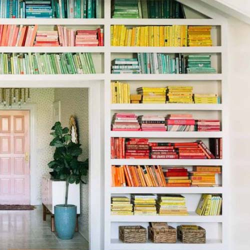
When clients have a large display of books in a high-traffic area, like a family room, I love turning the bookshelf into a display, rather than just a function. There are a few steps to this:
Instead of cramming all your books on a shelf to fit, try grouping them by color for a super chic and purposefully monochromatic look. You can remove the books’ jackets to show the spines if the colors work better that way.
Alternate between traditionally placed vertical books and some horizontal stacks. Place any cool accessories you may have (or framed photos) atop a pile of stacked books.
Allow for some negative visual space between book groupings. This will give you that really stylized look. Also, instead of pushing all your books to the back of the shelf, pull them about halfway to the edge of the shelf. This will give the illusion of a larger, more spacious built-in.
Remember: The key to this look is restraint. So if, after you’ve pulled everything out and reorganized, you have a few books that didn’t seem to fit anywhere, put them somewhere else instead of trying to squeeze them back in where they don’t belong.
Note: This tip does not extend to seforim shelves. Seforim, whose beauty goes far beyond decor tips, are most impactful when organized by topic, and of course they should be standing upright when not in use.
2. Create a landing spot, for anything and everything.
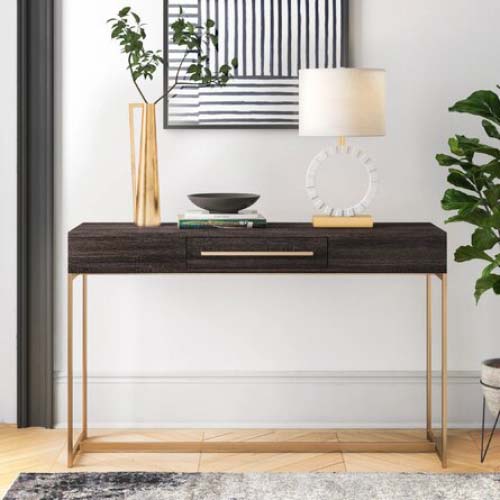
We (or maybe just I) live by the following mantra — don’t put it down, put it away. While my husband may not feel the same emotion evoked by such a phrase, he puts up with it (and me) nonetheless, and it really does make a difference. Everything deserves a spot, and a clean, decluttered space will immediately feel more tailored and put together than a messy one.
This especially goes for areas that tend to serve as quick landing spots for mess. Think foyer console tables, living room coffee tables, or kitchen countertops. If you have any spare serving platters, trays, or bowls, try placing them in some areas to catch keys, sunglasses, batteries, produce, art projects, etc. You’ll not only have all your clutter hidden away, but you’ll also be able to display some of those beautiful pieces that would otherwise sit untouched until you entertain.
3. Hide your cords and wires.
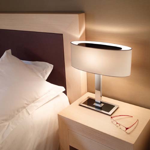
This may seem like a minor touch, but it really does make a big difference. If you have any table lamps, computer desk wires, or extension cords, try taping them against the length of any furniture legs, underneath any rugs, and along as many baseboards as possible. When we do furniture installations, we usually poke small holes into any area rugs to get rid of any additional wiring that may be lying around. This will make all of your fixtures and electronics look completely built-in and hard-wired, without actually paying an electrician to do so.
4. Take inventory of your bulbs.
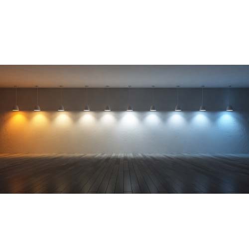
Good lighting is the backbone of any well-designed space. Adding the right warm glow or pop of brightness can make the world of a difference. Spend some time going through your bulbs in any floor lamps, table lamps, ceiling fixtures, pendants, and even pot lights to ensure that the wattage and Kelvin (the color temperate of the bulb) set the right mood for the space. I like it when a living or dining room has a warm, slightly dim glow, but bathrooms and kitchens should be brighter and cooler for utility and functionality. Play around with whatever bulbs you already have (wattage permitting) to instantly change the feel of your space.
5. Change up your layout.
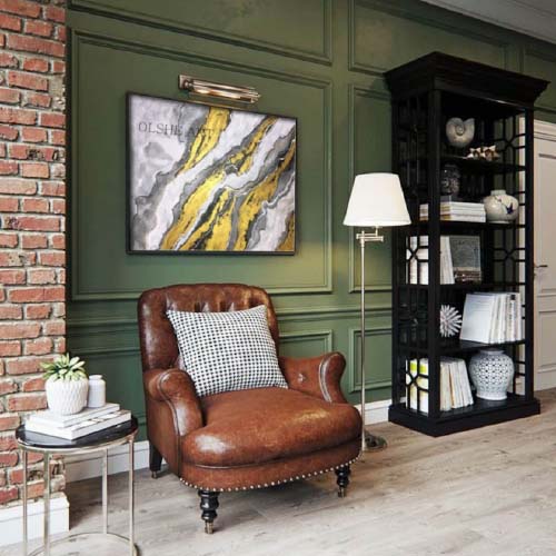
This one may seem like a copout, but I promise it’s not. As a designer, I always feel the need to be the guinea pig and try things out in my own house for my clients. I’m constantly rearranging furniture in my house and trying out new layouts with my existing pieces (shout-out to my husband for putting up with my shenanigans and always being available to schlep a sofa up and down three flights of stairs whenever my inspiration strikes). And I kid you not, each time I do this, I feel like I’m in a new space.
It can be as simple as rotating your coffee table or as drastic as swapping rooms, but don’t be afraid to shuffle things around every now and again to give your home new life.
I’ll end with this. A home is only as beautiful as the intangible that you fill it with. At the end of the day, all of this — furniture, decor — is just stuff. Someone once told me something that has stuck with me throughout my career. People will always remember how you treat them more than they’ll remember how you or your space looks. So instead of being embarrassed by a poorly lit, small apartment, fill it with love, kindness, and an open door, and it will be more beautiful than any amount of furniture could make it.
Except the mold. You should get that taken care of.
Leia Whitman Karoly is the principal designer at Gowans Whitman Design Inc. in Toronto and can be contacted at leia@gowanswhitman.com.
(Originally featured in Family Room, Issue 20)
Oops! We could not locate your form.
