To each their own
| December 23, 2020Mood boards to inspire your bathroom updates, from small to large, black to white — and all the colors in between
Fly with Pattern
Designed by Tova Cook
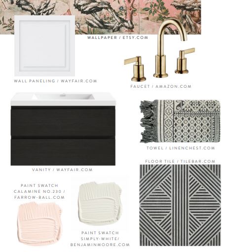
Dare to fly in pattern… but not just any pattern: think pink. One of my favorite ways to add visual interest is to panel a room halfway. Here, I channeled a bit of a DIY style by linking panel-ready wainscotting, adding visual interest. Installing a panel-ready sheet will save you money because you can glue it on yourself — no need to hire a carpenter — yet at the same time contributes to that textural wow factor.
Create an openness and functionality with a simple and impactful mirror that doesn’t detract from a busy pattern. To add an even edgier layer to this dressy bathroom, go with a fun geometric black and white tile. Adding a whimsical floor pattern brings the wallpaper to life.
Tova Kook, founder of TK Design, is a Woodmere-based interior designer who graduated from the interior design program at the Fashion Institute of Technology. She also has a degree in psychology and fine arts from Queens College. She is a mother of three and has been in business since 2013.
Natural Woods
Designed by Miri Lichtman
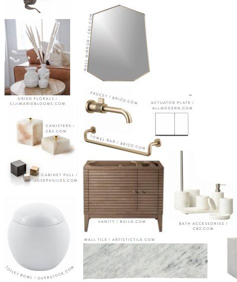
Calming atmospheres really help us wind down from daily hectic living, which is why I incorporated soothing natural tones here, using different textures and colors. A wood vanity grounds the space, while fabrics, like the rug, provide a softness an otherwise all-wood room wouldn’t have. Green accents add to that natural, relaxed feel, and the curved accessories work harmoniously to keep the bathroom feeling less angular. The brass faucet and mirror add visual interest, while the black accents keep the space pragmatic.
Even with a hectic schedule of being a mom and working an office job, Miri Lichtman tries to take the time to use her creativity. As someone who thrives when busy, she’s usually working on another project, whether it’s meal prep, photo printing, or organizing.
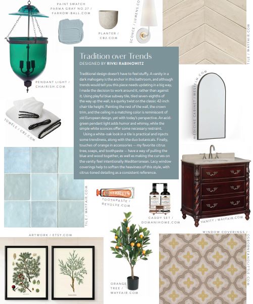
Tradition over Trends
Designed by Rivki Rabinowitz
Traditional design doesn’t have to feel stuffy. A vanity in a dark mahogany is the anchor in this bathroom, and I made the decision to work around it, rather than against it. Using playful blue subway tile, tiled seven-eighths of the way up the wall, is a quirky twist on the classic 42-inch chair tile height. Painting the rest of the wall, the crown trim, and the ceiling in a matching color is reminiscent of old European design, yet with today’s perspective. An acid-green pendant light adds humor and whimsy, while the modern white sconces offer some necessary restraint.
Using a white-oak look in a tile is practical and injects some trendiness, along with the duo botanicals. Finally, touches of orange in scent and color have a way of pulling the blue and wood together, as well as making the curves on the vanity feel intentionally Mediterranean.
(Originally featured in Family Room, Issue 11)
Oops! We could not locate your form.
