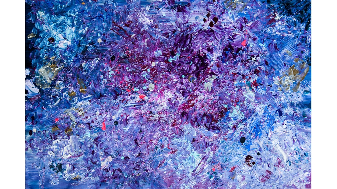
Playful Palettes
| November 18, 2020These unique color palettes are sophisticated yet versatile and can be used to update any space, not just the play area.
Creating unique color palettes for any room, while keeping a whimsical spirit in mind Sometimes it’s hard to reimagine a space that was always there and get inspired with new design. However, a new color scheme can really reenergize a room and open it up to a much better flow. In that vein, here are some great color palettes to get you in the spirit of play.
They’re sophisticated yet versatile and can be used to update any space, not just the play area.
Using these complementary color schemes as jumping points for inspiration, you’re well on your way to a fanciful yet elegant design.
PRETTY IN PINK

This color combination screams understated elegance. When I heard the name “Sulking Room Pink,” I knew it had to be good. This dusty and complex rose pairs well with softer pinks. Add depth by offsetting it with a dark color like the one below. The result is a rich feminine palette that works well in so many spaces. Find these shades via Farrow and Ball.
PLAYFUL POPS

This color scheme works well for those unafraid of some pops of color. Pink and orange are playroom playful, yet not garish. Add some blues and yellow to soften the vibrancy and balance out the other colors. These colors are part of the Benjamin Moore family.
CLASSIC BLUES

These colors are slightly more masculine. Pair darker blues with lighter tones and some neutrals to tone them down. The results will feel very peaceful and serene. Although these blues are dark, they pair well with woods, metals, and whites. This scheme is sourced from Farrow and Ball colors.
LOVELY LILAC

This pairing is fresh and fun from start to finish, utilizing the different shades of lilac to bring out the color’s complexities. White Heaven has a purple undertone, which will soften the room while adding depth, while classic black can keep accents defined. This palette is curated using Benjamin Moore colors.
COLORS OF NATURE
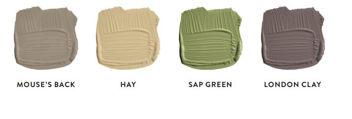
This combination is very reminiscent of objects in nature — different colored grasses, mossy stones, and clay tones. A very warm palette, it pairs perfectly with plants, natural woods, and dried flowers. Using their signature muted tonal values, these paints are pulled from Farrow and Ball.
Shiri Feldman heads Shiri Feldman Interior Design, a full-service design shop located in New York City. Having attended the New York School of Interior Design and graduated from the Jane Packard Floral Design Program, Shiri has experience in high-end floral design, set design, event planning, spatial design, landscape design, multifamily design, and more.
Contact her at shirifeldmaninteriors or www.shirifeldmaninteriors.com.
(Originally featured in Family Room, Issue 010)
Oops! We could not locate your form.

