Part II: In the Background
| May 18, 2021You gather your kids, wash their faces, and pose them, but are you thinking about what’s behind them?

The background is generally what makes or breaks the image. You need to look for a background that won’t distract from your image; usually, if the background doesn’t distract from your subject, it will complement it.
So, the first thing you do is clear the background of any distracting objects (including, and especially, people). Look at the pictures below. While the background is blurred out, see how the image on the left has an electrical box? That definitely distracts the eye from Elisheva. The image on the right is nearly the same image, but without distraction — and look how much better it is!

The next set of images is suffering from a less damaging issue — but it’s still suffering. While there’s not one specific thing in the background distracting us, the background is just too busy. Compare this to the simpler background of the image on the right — the lack of distraction means that the star of the show, Elisheva, can really shine.

The Eye of the Beholder
We’re all familiar with the famous saying, “Beauty is in the eye of the beholder.” And it is! But that’s not the full story. There are objective rules to beauty — and you can master them so you can create objectively stunning photos.
Certain colors are more pleasing to the eye than others — compare brown and gray to green and blue. Certain textures are more beautiful than others — compare the texture of a cement floor to the texture of clouds. Some patterns are boring and some are exciting, etc.
It makes sense to learn the rules of objective graphical beauty and to use them as your backgrounds. Look at the stark difference in these two images. While the one on the left isn’t an ugly background, it lags far behind the one on the right. I can’t stress this enough: Find beautiful backgrounds!

Near and Far
Another hard-and-fast rule is to get your subject far from the background. The further your subject is from the background, the blurrier the background becomes. (This concept, called “depth of field,” is beyond the scope of this article.) Our eyes are primarily attracted to sharpness, so if you have an image with two objects, one sharp and one soft, your eye is naturally attracted to the sharper object. If your subject is close to the background and your background is in focus, it will vie for your attention and distract from the subject.

Look at the photos below. In the photo on the left, while Elisheva is clearly the dominant subject, the sharp graphics of the cactus pull at your eye and reduce the viewing experience. In the photo on the right, the cactus adds a pleasant drop of color and texture, but your eye is focused on Elisheva.

Keep it Comparable

This rule makes such a difference — yet so few photographers are conscious of it. You want to have comparable exposure in your subject and background, which means they need similar light levels. For example, if your subject is in a shady area (which is generally what you want) then your background should also be largely in shade.
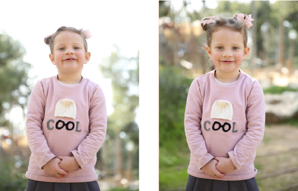
The reason for this is twofold: First, an overexposed white area in your background creates a vacuum of sorts that sucks out the emotional power of the image. Second, if the white area borders the subject, it can also compromise the subject’s contrast from the background.
In the photo on the left, the background is overexposed. Look how the edges of Elisheva have also been burned out.
Contrast that with the image on the right, which has a comparably exposed background. Following this rule really gives your photos an immediately professional feel.
Show Your Colors
This rule isn’t always possible, but when you can, try to keep your background a very different color from your subject. Look at the photos below — see how having a different colored background makes our subject pop? Creating a strong contrast between your subject and background is paramount!

Subjects and Significance
Here’s a subtle one: Sometimes, your background features something of significance. In the image below, by having a playground in the background I’m creating context for the image. It’s no longer just a pic of Elisheva — it’s now a pic of Elisheva at the park!
When you do this, there’s a risk there will be overlap between the subject and the “feature” in the background.
When there is overlap, the subject and the background feature compete with one another.
Instead, give each their own separate place. When you create a little distance between them, they complement each other rather than distract from each other.

Coming next: Light it up!
Shmuel Diamond is a leading wedding and portrait photographer. His photography school, Zero to Pro, has helped hundreds of students achieve professional-level skill.
(Originally featured in Family First, Issue 743)
Oops! We could not locate your form.


