Part I: The Two Foundations
| May 11, 2021Producing those pictures is no magic trick; good photography is a science you can learn

In this series, I break down the formulas and methods I’ve developed over my nearly 20 years in the industry so that anyone — whether you’re an amateur photography buff with your first DSLR, still holding on to your point-and-shoot, or a mom using your phone’s camera — can create frame-worthy photos. Let’s get started.
Any image is comprised of several elements. We can group them into two broad categories: composition and subject. To the uninitiated, the two are inseparable. But if you want to create fabulous photography, you need to be able to peel them away from each other and assess them individually.
So what’s the difference between composition and subject? Look at these images below.
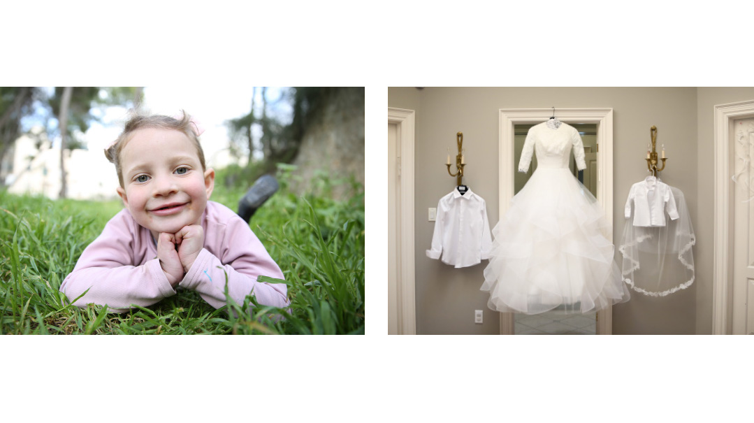
It’s easy to figure out the subject of these pictures: in the first, it’s an adorable little girl — my daughter, Elisheva — and the second is a bride’s wedding gown. The subjects have nothing in common. However, they do share a very similar composition. Can you spot it?
If you want to get all jargon-y about it, you can define “composition” as the underlying geometric structure of an image. Or you can skip the jargon and just think of it as the shapes and lines encoded beneath the subject.
Take another look at those two images. Can you spot the triangular composition that they share?
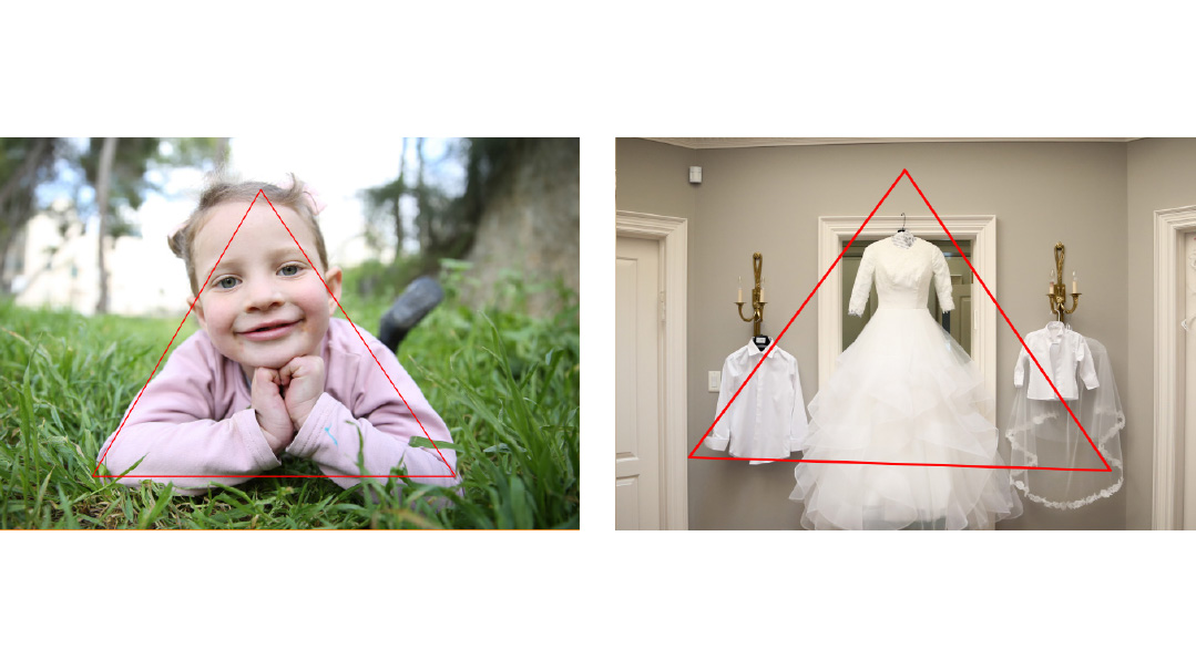
It takes practice to train your eye to pierce through an image’s “outer trappings” (the subject) to see the underlying shapes and lines that form the foundation of the image (composition), but it’s the first key to crafting impactful images.
But where does this understanding leave us — the avid and intrepid amateur photographers snapping away, taking precious pics of our kids and grandkids?
Being aware of composition can help you set up better photos. For example, triangles have a dynamic energy to them. So if you position your child with her hands on her hips, creating a triangle, you’ll have an energized image.
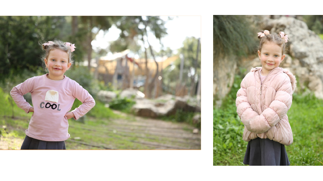
If you want to create an image with a more relaxed, passive feel, you can have your subject hold her arms in a way that creates a circular shape.
Crop in Close
Another vital element of composition is to zoom in — cutting away any extraneous space. This is, hands down, the easiest way to make the most dramatic difference in your photos.
When there’s too much space, the image suffers a loss of energy. Think about it: Where does the beauty of this picture reside? In Elisheva’s face, obviously. In the first photo, her face makes up about 1 percent of the frame; in the second, it’s closer to 5 percent. Just by cropping in close, we’ve quintupled the size of the feature that makes the photo shine, and reduced the boring background.
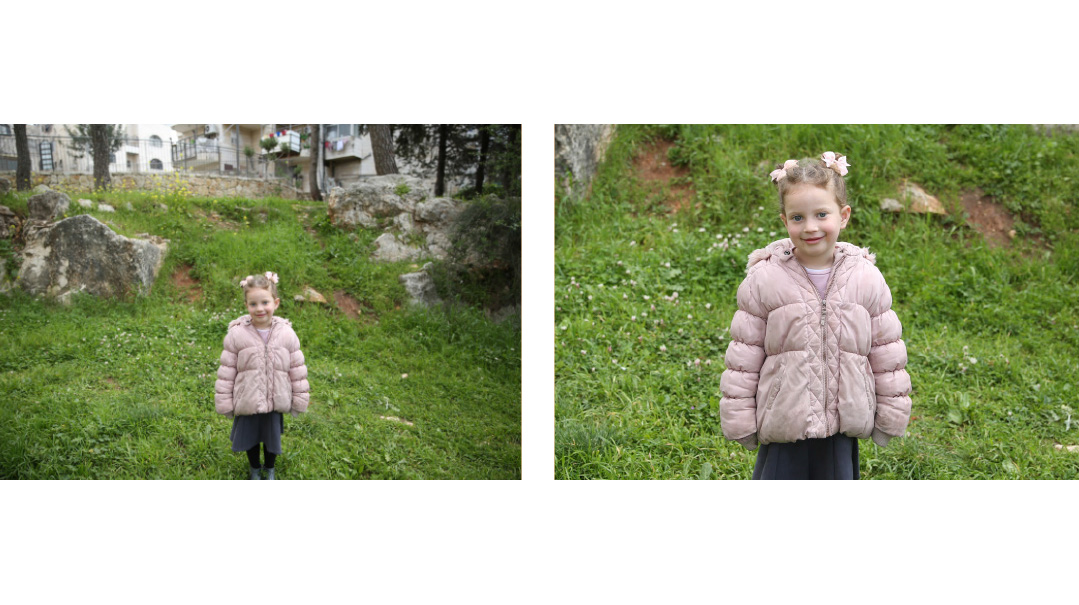
Does this mean all your images should be cropped in close? I’d say the majority should be tight, but if you do have an exceptionally stunning background or the location has emotional relevance (think the Kosel), then you can leave more room for it. Still, it’s always better to edge in on too close rather than too far.
Vantage Point
The vantage point is all about how high or low you hold your camera.
You generally want to hold your camera in the center of the part of your subject you want the photo to focus on.
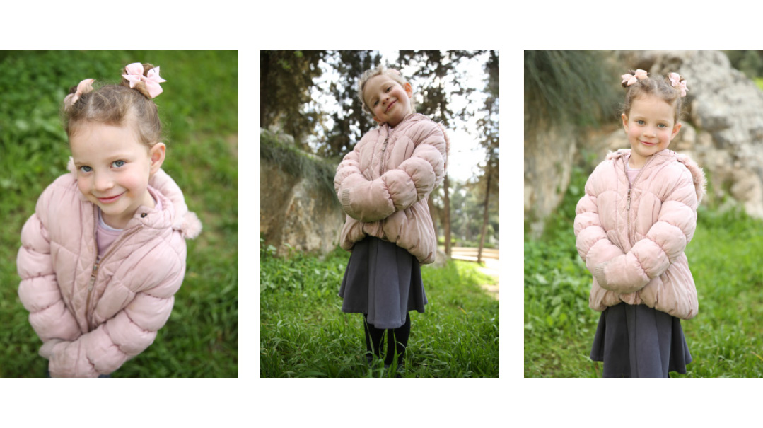
Check out the three images above. See what a profound difference the vantage point can make? In the first, we’re looking down at Elisheva. It’s an endearing and engaging look, but it’s a novelty image — don’t overuse the pose.
In the next image, we’re very low, looking up, which makes the subject look dominant and heavy. That can be a good pose for a picture of men, but it’s definitely not for little girls.
The final image is perfectly level. I crouched down to get my camera at the height of her chest, which gave the photo a straightforward, comfortable look.
Balance
Getting the balance right in an image takes a little practice. It’s like measuring without using a ruler, or adding the right spices to a dish. You need to trust your internal gauge.
Despite this being a tricky skill to master, it’s objective — when you show images to people, they unanimously agree that balanced images look better.
Look at these pictures and see which you prefer.
It’s the one on the left, isn’t it? Why?
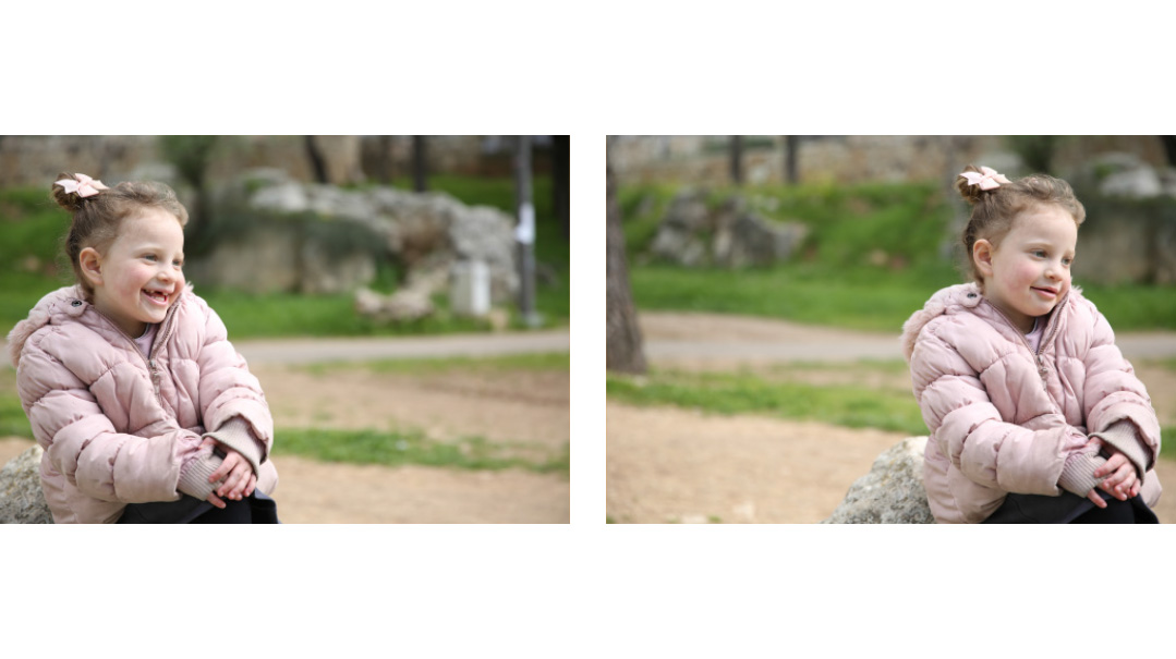
When you look at the photo on the left, the first thing you notice is Elisheva — in particular, her face. Since she’s looking toward the empty space, your eye follows that direction. So even though she’s all the way over on the left, since your eye’s being drawn toward the right side of the frame, this image feels balanced. Your eyes’ path flows effortlessly over the entire canvas.
Now take a look at the photo on the right. Just like it did in the first photo, your eye immediately lands on Elisheva, but in this image, your gaze is pushed toward the edge of the frame. This results in an uneasy tension, with the image being weighted down on the right side.
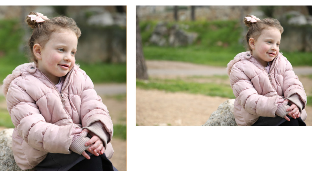
Now take a look at the next image. All we did was crop the above photo — but now it feels balanced! It’s all relative.
Frame it
You frame an image by using some graphical element, generally in the foreground, to create a “frame” for the image. The difference this makes is huge. Professional photographers are constantly searching for natural frames — they give the image depth, keep the viewer’s eye from falling out of the canvas, and unify the frame. Compare the photos below: see how much more compelling the one with a frame is?
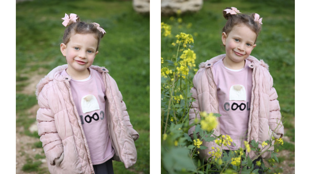
Go out and spend some time taking pictures of the cutest subjects out there — your kids —paying attention to the images’ composition as you do. You’ll be amazed what a difference it can make.
Coming next: Backgrounds
Shmuel Diamond is a leading wedding and portrait photographer. His photography school, Zero to Pro, has helped hundreds of students achieve professional-level skill.
(Originally featured in Family First, Issue 742)
Oops! We could not locate your form.


