Sited

Another demographic with its own reading habits: the online reader

One of the challenges and privileges of working at this magazine is the fact that it caters to so many demographics. When we plan our grids, we always talk about “the mix” — ensuring that each issue has a balance of heavy and light, inspiration and information, news and human interest. But there is also a mix of “types” that it targets. When we hear from readers of different ages, stages, and educational backgrounds that the magazine speaks to them, we know we’re doing a good job.
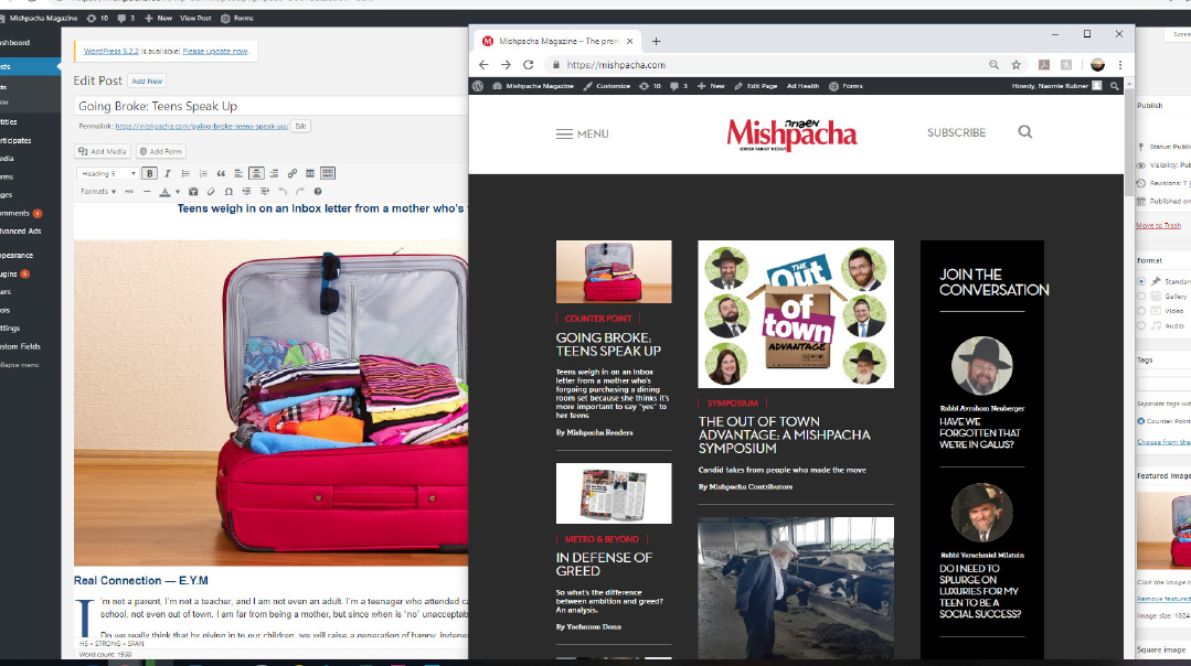
Over the years, we’ve noticed that there’s another demographic with its own reading habits: the online reader. Mishpacha has hosted a website for many years, but now we’ve upgraded the site with a strategic revamp that aims to meet a different reading style.
One of our considerations when building the print magazine is the fact that it’s viewed by many readers as Shabbos fare. This doesn’t necessarily mean that they’re reading it on Shabbos, but it’s bought with Shabbos in mind. Sometimes, when weighing a cover story, we’ll ask ourselves: Would this cover belong on the coffee table on Shabbos? Is this something our readers would want to discuss during the seudah? Yes, people may follow a certain trend or story on their screens during the week — but is it what they’re looking for in their Shabbos reading?
On the website, the considerations are different. While the material is drawn from the print magazine and bears that classic Mishpacha imprint, the target demographic is not the Shabbos reader. Even a dedicated fan of frum publications reads differently, and seeks different things, when reading on a screen during the week. So the assumption is that they’re not looking for the physical magazine experience of a three-part package that you finger your way through, with a strong internal structure of op-eds at the beginning, features in the middle, and lighter material at the end.
Bearing that in mind, the site is organized differently. Instead of breaking down the material into “main magazine” versus “Family First” or “news” versus “community,” it allows readers to access the material by category, tapping the rich reservoirs of so many years of features, interviews, and stories by their shared themes. When I spent some time on the site seeing where my clicks took me (I clicked on the “shidduchim” category at the bottom of the home page), the experience felt very different from paging through a weekly magazine. It was fascinating to access a decade and a half of archives, and see the overlapping and intersecting layers of so many different styles of content complementing one another to round out a single topic.
While our primary target is always our core reader, and any decisions regarding spiritual standards were made with them in mind, there’s another demographic that has been asking for an upgraded site. Many of our interviewees — like politicians, pundits, analysts, and influencers — no longer deal much in the world of print media. They might keep a hard copy of Mishpacha on their desk, but when they want to share their opinions and quotes with the wider world, they’ll ask us for a link to the online piece. We’ll always be a print magazine at heart, but the new site allows us to continue nurturing our relationships with these sources in the medium they navigate best.
And then there’s another demographic we thought about as we rebuilt the site. Our publisher, Eli Paley, often tells us that he takes along extra copies of the magazine when he travels, to share with unaffiliated Jews who are curious about religious life. Time after time he hears that they’re amazed at what they find: a glimpse at a vibrant, colorful world — complete with features, recipes, fiction, and news — all through a Torah lens. This is a demographic that may not have quick or easy access to a frum print magazine, but can surely benefit from an online source. The new website also keeps these readers in mind, as part of our mandate to share the beauty and wholesomeness of the Torah world and frum lifestyle
But one of the most exciting opportunities afforded by the upgraded site doesn’t revolve around external relationships. It actually centers around the same couple of pages in the print magazine. For years, my aunt has been making a single request: “One week, just print an entire magazine of Inbox letters… that’s the best part!” I can’t help but agree. Week after week, we’re impressed and moved by not just the quantity, but the quality of your letters: the insights, the personal takes on communal issues, the way you conduct spirited albeit respectful conversations in our pages. The site allows us to take the weekly Inbox conversations to new dimensions; it will continue those conversations in a more interactive forum by asking a community figure to lead and moderate. We’re excited to watch it unfold.
But even as we take the Inbox to a new platform, it will always reserve pride of place right at the beginning of our print magazines — in some ways, the most effective showcase of the best of frum reading. Because when we sat down to figure out the direction for the new site, we kept coming back to those accumulated years of intelligent, thoughtful, high-caliber letters to the editor — which more recently spawned columns like Open Mic and Counterpoint — to highlight just what kind of forum Mishpacha has become. We hoped to build on that foundation, and on our sense that there’s more to be had on this wider platform — even as the print magazine remains our flagship product, and its longtime readership our core audience.
(Originally featured in Mishpacha, Issue 771)
Oops! We could not locate your form.


