Weekly Struggle


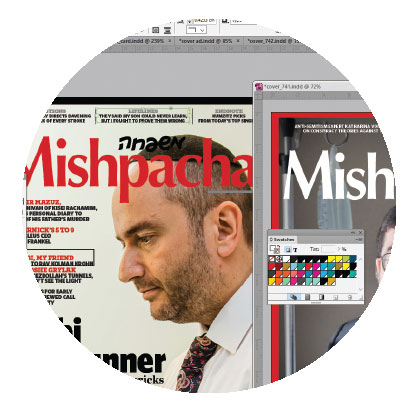
Years ago, I was meeting with the editor of the Hebrew-language Mishpacha when he pointed to a printout on his desk. It was a mock-up of the week’s cover with all the usual elements: logo, photo, secondary stories, large screaming central text.
“Every week, it’s the same struggle,” he confided. “No matter what the story is, I’m always having the same fight with myself. What kind of text do I put on the cover — the most compelling or the most accurate?”
That editor no longer works at Mishpacha, and the office has moved twice since the meeting. But his concise description of the weekly struggle hasn’t budged.
However you view the function of a magazine cover — as a window display for the goodies inside, a good gauge of a publication’s editorial and ethical values, or a more visual and concise table of contents — it carries very real weight.
But covers hold an inherent limitation: They aren’t good vehicles for nuance. With limited space and limited opportunities to catch a reader’s eye, they’re like an elevator pitch on steroids. That hyper-accelerated format presents a lot of challenges, especially for a nuanced product like this magazine.
The first challenge in building cover text is the simple issue of length. Each cover line has to encompass a long story — sometimes over 3,000 words — with just a short phrase. If you have any experience in public speaking, you know that it’s easier to speak long than to speak short. The same is true for writing, and it’s even truer for cover text. It can be excruciatingly difficult to whittle down the essence of a complex story to just one line or quote.
Our cover text three weeks ago went through several permutations before reaching its final version. The original version read “Brain Trust: Elchanan Schwarz, traumatic injury therapist by day, voice of Fiveish by night, heals with humor and heart.” The final version was pared down to “With Humor & Heart: Elchanan Schwarz heals traumatic injuries by day and brings Fiveish to life by night.” It’s just a bit shorter, but the syntax makes it quite a bit tighter.
Then there’s the issue of the “promise.” Cover text should be dramatic and compelling. But it also shouldn’t promise something that the product doesn’t deliver. Satisfying both of those criteria is a tough balancing act. If you go with the most dramatic option, you might disappoint your readers when they read a piece that isn’t all the cover promised — not all that authoritative, not all that revelatory, not all that historic. But if you tone down your text, you may sell your product short with a flabby cover. Finding the perfect medium involves a lot of thought and discussion (some people might describe it as “arguments” — I guess those people belong to camp drama).
Typical dramatic cover fare includes phrases like “reveals the secret,” “uncovers a sinister plot,” “unravels the mystery,” and “bridges worlds.” We do use those phrases — who can resist a secret? — but we try to use them only when the story really delivers.
The dramatic versus accurate dilemma has a mirror image: As much as you want to draw readers to your material, you don’t want to destroy their reading experience by giving away too much. This often comes up when building the cover text for LifeLines pieces. Often we’ll find ourselves playing with two or three different options. One might capture the story perfectly, but we’ll go with a different option that conveys the tension without giving away the resolution. Because as much as we want to grab your attention, we don’t want to spoil the experience.
Even after we find the right phrase — one that conveys the story accurately and alluringly, teases just so much without ruining the taste — there are still the little details to agonize over. Details like trying, whenever possible, not to repeat key words or to overdo question marks. Details like similar length and different rhythms for secondary stories.
Then there are little details with bigger implications. Take the word “exclusive.” In the world of media, it typically means “an item or story published or broadcast by only one source” — basically, that this is the only publication with access to the subject. But lots of our readers are less literal and see the word to mean “a really great scoop” or just “what a great piece!”
So do you put the world “exclusive” on your cover if the subject has shared his story with other outlets, or do you save it for that genuinely rare subject who chose to share their story with you alone? Do you stick to the professional meaning of the term, or do you get more heimish? (And if every great story is “exclusive” and hopefully every cover story is great, then does the word mean anything anymore?)
When you’ve worked long and hard to build a reputation of integrity, every little word carries big undertones. To answer the question of that long-ago editor, we want to build cover text that achieves both parameters. To be the most compelling and the most accurate — to promise big and to deliver what we promise.
(Originally featured in Mishpacha, Issue 744)
Oops! We could not locate your form.


