Amazing Architecture

Most architects design buildings to be practical, but some wants their designs to tell a story or make a statement
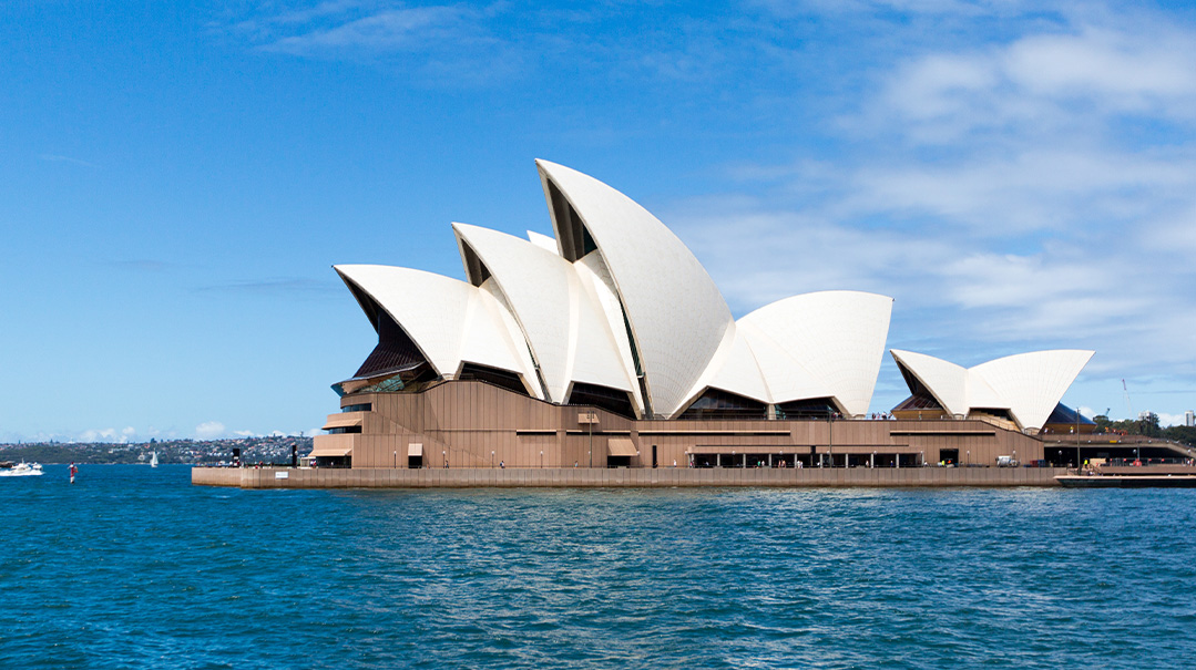
Sydney Opera House
Sydney, Australia
The gleaming white sails of the Sydney Opera House in Sydney, Australia, is not just a symbol of the city, or even of the country — it is a symbol of the entire continent.
Perched at the edge of Sydney Harbour, the opera house is home to several concert halls and theatres that host 1,600 events each year. Don’t let the name mislead you — the opera house hosts much more than just operas. People come to watch a whole range of live performances, including concerts, ballets, circuses, and plays. It’s also Australia’s top tourist attraction.
Those sail-like white structures that make the opera house so iconic are actually called “shells.” The shells look smooth, like they’ve been dipped in white paint, don’t they? They’re actually covered with more than one million clay tiles in both glossy white and matte cream. These tiles became known as the Sydney Tile.
The architect, a Dane named Jørn Utzon, had a special passion for sailing. Since the opera house was to be situated on a harbor, he designed the building to look like the sails of ships. The construction of the design was super complicated! The engineers had to figure out how to make the shells look curvy. No two shells are alike, which made things even more complicated. Models of the shells were tested in a wind tunnel to make sure they would hold up during wind and storm conditions.
The construction of the building required several innovations, which helped lead the way for future architectural designs. One of those was a computer program that was created to help with the building of the interior arches that hold up the shells. That might not sound so impressive in 2022, but this was back in 1959! The opera house was also one of the first buildings in the world that used araldite (a type of adhesive) to glue sections of structural elements together. It worked so well in Sydney that it soon became an industry standard. The air-conditioning system, which at 17,000 cubic meters was the largest in Australia at the time, was also innovative. It harnessed the harbor water to create a water-cooled heat pump system that is still used today.
The project took years; in fact ,it was completed ten years late. It was also more than 1,000 percent over budget. But those delays and extra expenses sure were worth it!
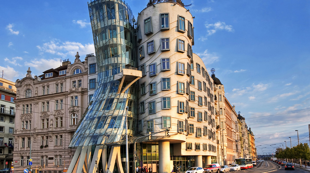
Dancing House
Prague, Czech Republic
One half of the building looks normal while the other looks… squished. Did the architect take a hammer to his building and smash a dent in it? It certainly looks that way, but that’s not quite what happened.
In 1989, the Warsaw Pact, led by the Soviet Union, finally collapsed, and many former Communist countries turned to democracy, one of which was Czechoslovakia. It later split into two countries: the Czech Republic and Slovakia. In the decade following the fall of Communism, determined Czechs wished to shout their good fortune from the rooftops. Literally.
One of those determined Czechs was Vaclav Havel, a leader of the Velvet Revolution that helped end Communism in the country. A native of Prague, he happened to live next door to a very interesting site. In 1945, the US military bombed Prague (by mistake — they had meant to bomb Dresden, Germany) and this historic building was destroyed. For years, the bombed-out ruin ruined the street. Together with Czech architect Vlado Milunić, Havel came up with an idea to transform the eyesore and make a statement about the new Czech Republic at the same time.
Milunić recruited Canadian-American architect Frank Gehry to help him with this unique project. The two met in Geneva in 1992 and conceived a building that was nothing like Prague had ever seen before.
The building was to have two parts — static (still) and dynamic (moving) — to reflect the Czech Republic’s transformation from Communism to democracy. Gehry was inspired by two American dancers, Fred Astaire and Ginger Rogers, and the building was designed with the dancers in mind. The ordinary half of the building represents the “static” part, while the rest of it represents the “dynamic” part. So, you see, the building isn’t squished — it’s dancing! And its nickname is “Fred and Ginger.”
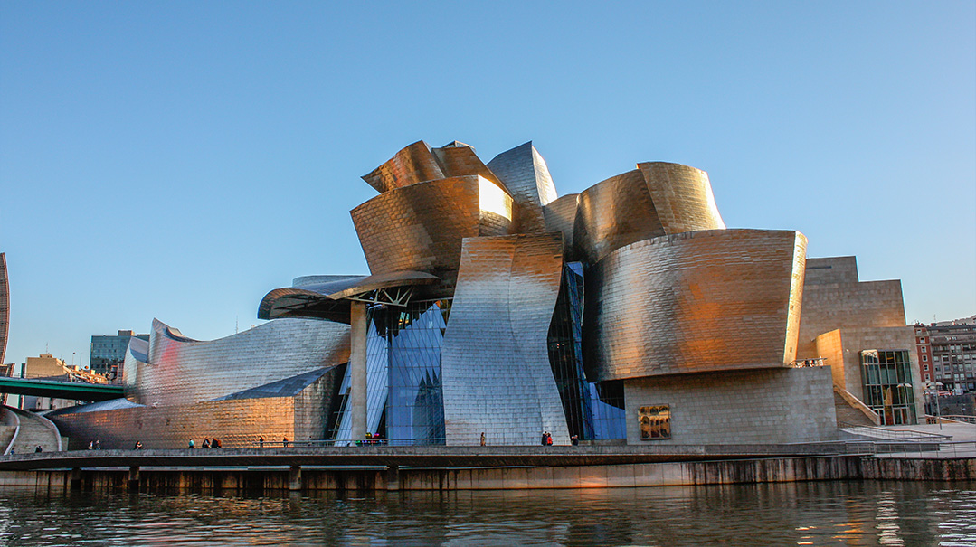
Guggenheim Museum
Bilbao, Spain
Frank Gehry seems to have made quite an impact on the world of architecture. One of his most famous works is the Guggenheim Museum in Bilbao, Spain (not to be confused with the museum of the same name in New York City; there are also Guggenheims in Venice, Berlin, and another one planned in Abu Dhabi). To date, the Bilbao museum is easily the most spectacular of the Guggenheims, although the museum in Abu Dhabi may outshine it once it opens in 2025. Don’t worry about Frank Gehry being insulted — he designed the Abu Dhabi one, too.
The Guggenheim Museum in Bilbao sits on the banks of the Nervión River. From across the river, the metal-clad building looks like a warship from outer space that’s as terrifying as it is beautiful. Some say it looks like a ginormous flying fish. Actually, the building’s curves were meant to be completely random, but its location near the river must have somehow influenced its shape.
In 1991, the city of Bilbao was in bad shape. The local government was desperate to give the city a much-needed boost and offered to fund the construction of a Guggenheim Museum. Frank Gehry recalls that the town representatives who met with him to discuss designs for the future museum said to him, “Mr. Gehry, we need the Sydney Opera House. Our town is dying.”
The resulting design — a mass of titanium and stone — is so over-the-top and ostentatious that Gehry himself wonders what on earth he did to the poor townsfolk who need to see the monstrosity every day. But whereas most unusually shaped buildings come with plenty of criticism, everyone loved the Guggenheim from the very beginning. The construction of the building ran on time and within budget, another very unusual feat for such type of architecture.
Thankfully, the ambitious design helped the city achieve its goal. Bilbao is now a flourishing city with a thriving tourism industry.
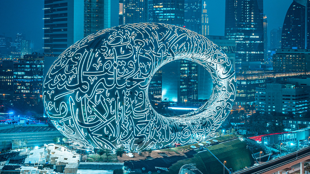
Museum of the Future
Dubai, UAE
Opened in February 2022, the Museum of the Future is the newest addition to the list of the world’s wacky and wonderful buildings. It looks more like an oversized sculpture than a building, but it does in fact contain a fully functional museum on the inside. And what a museum it is!
Before we take a peek inside, let’s talk about the exterior. True to its name, the building looks very futuristic. Perched atop a grassy hill, the museum has three main elements: a grassy hill representing earth, the circular building that represents humanity, and the void that represents the unknown future. And is that writing that we see on the building? Why, yes, it is! The Arabic calligraphy is actually made up of windows and looks pretty fantastic. It reads three quotes from the prime minister of the UAE, Sheikh Mohammed bin Rashid Al Maktoum:
- “We won’t live for hundreds of years, but we can create something that will last for hundreds of years.”
- “The future will be for those who will be able to imagine, design, and build it. The future does not wait, the future can be designed and built today.”
- “The secret of the renewal of life, the development of civilization and the progress of humanity is in one word: innovation.”
Keeping to its theme, the construction of the building itself was also futuristic, as it is partially 3D printed. The facade is made out of 1,024 stainless steel pieces that were manufactured by robots. The building is much bigger than it looks. It stands 225 feet (77 meters) tall and has seven floors dedicated to various exhibitions.
The museum is intended to promote technological developments and innovation in the fields of robotics and artificial intelligence, and aims to create solutions to challenges in different sectors like health, education, energy, and transport. As you can imagine, the inside looks like something out of science fiction. There are bionic robots inspired by nature that fly overhead, huge interactive screens, and amazing LED displays. Every part of the museum is futuristic. In the café, your coffee is prepared by a robot named Bob the Barista.
Fallingwater
Pennsylvania, USA
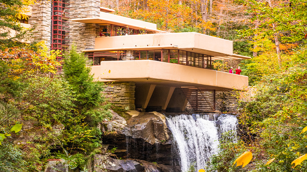
I know what you’re thinking — this house looks perfectly ordinary compared to the other architectural masterpieces in this article. But no article about architecture would be complete without Frank Lloyd Wright’s Fallingwater.
Frank Lloyd Wright died in 1959, but he is still America’s most famous architect. Fallingwater is Wright’s most famous masterpiece. One look at a picture of Fallingwater and it’s obvious why it’s called so. The estate, which is in the Laurel Highlands in Pennsylvania, was a vacation home for the wealthy Kaufmann family of Pittsburgh. Edgar J. Kaufmann wanted the house to sit at the bottom of the waterfall so that it would have a view of the falls. But Wright wanted the house to become one with nature. He placed the house right over the falls, which is what makes the house so iconic. The house was constructed from stone that was taken from an old quarry on the estate. Wide windows all along the house connect the inside with the great outdoors and make the whole house feel like a cave.
Decades after it was built, Fallingwater is still studied and visited by aspiring American architects, as well as many architects from oversees.
Ramot Polin
Jerusalem, Israel
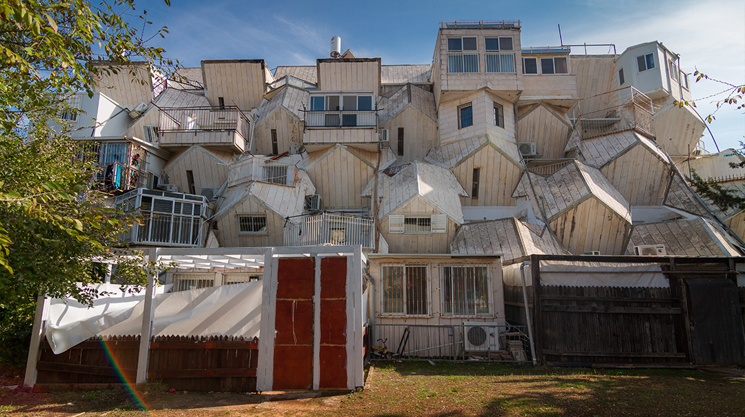
Locals refer to it as a “housing project for honeybees.” Others think it looks like an egg carton. Whatever you think it looks like, you’ll certainly understand why these odd structures have been named one of the “World’s Strangest Buildings.” The Ramot Polin project, which was constructed after the Six Day War, is comprised of 26 L-shaped buildings. The buildings are grouped in sections of five or six buildings, with an internal courtyard between sections. These courtyards are a take on the traditional courtyards of Jerusalem’s historic neighborhoods.
But obviously we’re not here to talk about the courtyards. I bet you’ve noticed the slanting external walls. I bet you’re wondering if the internal rooms also have slanty walls. You betcha! These buildings are strange indeed.
Renowned Israeli architect Zvi Hecker created this unique modular design. Hecker is famous for his geometric architecture. His design for Ramot Polin was very innovative in that it was constructed with prefabricated concrete slabs. Nowadays, prefab construction — which has buildings constructed off-site and then put together on-site — is a common and cheap solution, but back then it was a new idea.
Ramot Polin may have looked cool, but as a residential project, it failed pretty badly. The small windows make the rooms dark, the slanting walls are a waste of space, and the narrow porches are practically unusable. The neighborhood was originally slated for middle-class Israelis, but once they took a look at the inside, they turned up their noses. So, Ramot Polin, with its low rent, became a thriving chareidi community. The new residents quickly made changes to their apartments, like widening the windows, enclosing porches and enlarging rooms. By now, not one of the buildings remains in its original state.
Until today, Ramot Polin serves as a reminder for architects that the buildings they design must be functional and practical as well as interesting to look at.
(Originally featured in Mishpacha Jr., Issue 909)
Oops! We could not locate your form.


