Your True Colors
| July 21, 2021Here’s what experts have to say on what color psychology does to change the way we feel
Ever wondered what it is about green grass and blue sky that makes you feel so good? Here’s how color can change your mood — and what you can do to surround yourself with the right colors — even once summer comes to a close.
Here’s what experts have to say on what color psychology does to change the way we feel — and how you can design the spaces around you to give yourself that energizing boost all year long.
NOT ALL BLACK & WHITE:
The basics of color psychology
It’s too cold in here.
Can you turn up the heat?
Your lattes are yum, but brr…. It’s a little chilly.
The management of a popular coffee shop was frustrated. The customers were constantly complaining about the temperature, even though their heating system was in excellent working order. Then someone hit on an idea: redecorate.
Huh? What difference would that make?
All the difference, apparently. The coffee shop redesigned their seating area, changing the paint color from a cool blue to a warm, cozy orange. The heating system remained exactly the same — but they never heard a complaint about the temperature again.
Color psychology explores the theory that colors have a real effect on our moods, emotions, and judgment. When we see something red, we assume urgency. Yellow has been found to increase anxiety and even dizziness — which, incidentally, is why you’ll almost never see yellow used inside an airplane.
And apparently, blue walls in a coffee shop made customers feel physically colder.
Blue’s not all that bad, though. Besides for being the hands-down winner for the world’s most popular favorite color, studies show that it evokes trust, calm, and relaxation. When the city of Glasgow, Scotland, discovered this study, back in 2,000, they changed all their street lights to blue — and the local crime rate decreased dramatically.
Colors, it seems, are super-powerful! And although the exact way we view different colors varies according to our past experiences and the culture around us (does white represent purity or mourning? Is pink for baby boys or baby girls?) — there are some overall effects of color that apply universally.
One example is the use of warm colors (including red, orange, and yellow) as opposed to cool colors (blue, green, purple). Warm colors are generally associated with warmth, friendliness, joy, and optimism — but also with feelings of anger, danger, or impulsiveness. Cool colors, on the other hand, signify peace, calm, tranquility — or alternately, sadness or indifference. Who knew that selecting colors could be so complicated?
COLOR CODING DECIPHERED
Ready for the nitty-gritty? Here are the kind of things we tend to associate with each color.
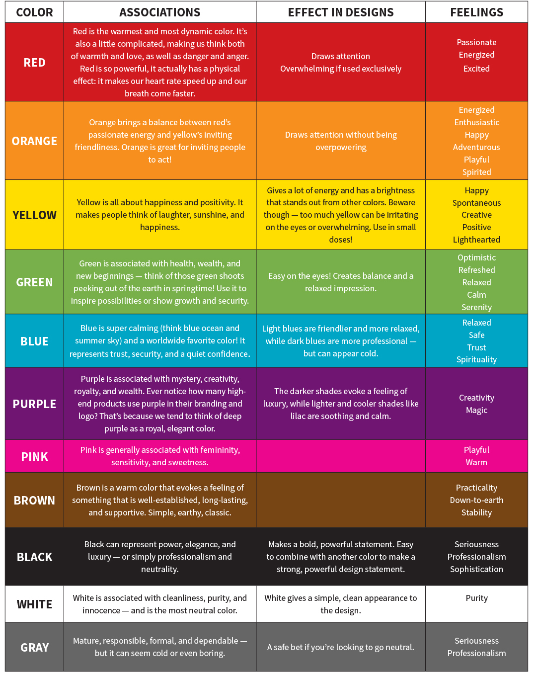
COLOR BY NUMBER
Theories of color psychology have been put to good use by people working in marketing and design. When companies advertise, they want to make sure that they don’t just tell you what they do using words. They also want to attract the right customers by using colors that reflect the company’s brand identity — the way they portray themselves and their style. Picture a fun and funky ad with bright, rainbow-colored text — it might be advertising a carnival, a day camp, or even a kids’ clothing sale, but it would be unlikely to attract customers for a multimillion-dollar law firm.
How do companies get customers to act fast? Often, by using the color red. Think about CLEARANCE signs, or some of the familiar logos we see all the time, such as Coca-Cola or Target. In fact, over 60% of retail brands use red in their logos! Since red is associated with emotions and urgency, the color plays a role in getting customers to feel strongly that they must buy this product, right now. Score for the company!
On the other hand, more than 75% of credit card companies use blue in their logos. You can guess why — they want to give an impression of tranquility and calm, showing you that they are reliable and trustworthy.
Using multiple colors gives a message, too. Ever noticed how Google uses the three primary colors, red, yellow, and blue, in their logo? It makes the brand appear both playful and fun, and user-friendly. What’s with the green letter ‘L’? Apparently, the green was added at the last minute to show that Google doesn’t follow rules!
WHAT’S ON THE MENU?
All this talk about colors is making me hungry… or maybe not. While red, orange, and yellow are known to make people hungry (can you think of any fast-food chains that use this fact to their advantage, by employing red and yellow in their logos?), blue has the opposite effect.
Restaurants take advantage of this by using the “ketchup and mustard effect,” branding themselves with a contrast of red and yellow. This is to get people both hungry and excited — so that they come and grab a bite! Less popular in the foodie marketing world is blue, which is known to suppress appetites; pink, which can look unnatural and turn people off the food; brown (unless you’re selling baked goods); and gray — no explanation needed there!
How about in your own humble home? Plating your food with an eye for color can help you turn every meal into a masterpiece.
The top choice for plating is almost always white, because the colors of the food look more vibrant and appealing against a white background.
Another thing to keep in mind is contrast: Studies show that people actually eat more food when it’s presented on a highly contrasting color plate. Have a ton of purple cabbage salad but not enough fries to go around? Try serving on yellow or golden-colored plates and see what happens!
PLAYING FAVORITES
Guess what — your favorite color can actually say a lot about your personality! Pick a color from this list (no peeking ahead!) and then find the description in the section below. Fun fact: The world’s favorite color is blue, followed by purple. Black takes last place.
Red / Orange / Yellow / Green / Turquoise (teal; mixture of green and blue) / Blue / Indigo (deep, dark blue) / Purple / Pink (soft/baby) / Magenta (rich, deep pink) / Gray / Brown / White / Black / Silver / Gold
Red: You’re confident, outgoing, and brave, and you enjoy being active and on the go.
Orange: You’re warm, friendly, and accepting of others — a social butterfly who makes a great friend.
Yellow: You’re cheerful, easygoing, and fun to be around, and you have a creative side, too!
Green: Your greatest strengths are kindness and compassion, and you build deep, genuine relationships.
Turquoise: You’re easy to talk to, idealistic and hopeful, and you make a great friend.
Blue: You’re a truth seeker; reliable, dependable, and trustworthy.
Indigo: You’re compassionate and understanding when dealing with others — while always holding onto your integrity and what you know is the truth.
Purple: You’re a free spirit with deep feelings, and a gentle approach when interacting with others.
Pink: You’re a kind, caring, and loving friend, and always take the other person’s needs into account.
Magenta: You have a strong imaginative streak, inspired creativity, and value beautiful surroundings.
Gray: You’re cool, calm, and collected — always! — and you carry yourself with confidence.
Brown: You have a strong practical side and a straightforward approach to life; people rely on you to get the job done.
Black: You’re a natural leader, and have the determination and strong will to go far.
White: You take a long-term approach to keep things organized, and have a positive view of life.
Silver: You have a strong intuition, a deep spiritual side, and the insight to help others — a powerful combination!
Gold: You’re charismatic and fun to be around, with a shining personality that’s uniquely yours!
TAP INTO THE POWER OF COLOR
That’s all good and well, you’re thinking. But what does it have to do with me? I’m not an interior designer.
Here’s the thing: You don’t have to redesign your entire house or become a marketing whiz to put these theories into practice. Understanding color psychology isn’t just a cool trick for interior designers; it’s a great tip to make your environment work in your favor.
And you don’t have to redecorate to make a difference. Think about the color of your notebooks, the accessories on your desk, or the pictures on your walls. Are they generally warm colors, which bring on feelings of energy, activity, and heightened emotion? Cool colors, with feelings of calm and relaxation? A rainbow mixture — which might be fun to look at, but not necessarily conducive to your focus?
There’s lots you can do to set the tone, without splashing out on new wallpaper. Hosting a party? Go for bright, warm colors. Like to exercise? Arrange some red or orange décor near the treadmill. Getting too distracted? Time to go green — this color helps you feel more balance and harmony.
Want to improve your productivity and focus on your work? Get rid of the multicolored knickknacks and choose blue for your desk accessories and the spaces around it. Blue calms the body and stimulates the mind, making it the color of choice to raise concentration levels, enhance communication, and help you get more work done in less time.
If you’re looking to get creative, the experts say that yellow helps. Maybe that’s why the classic pencil color is yellow! Purple can also inspire deep thinking, but it’s tricky — you have to get the right shade, or else it can be a distraction. Hmm, is it time to change up my trusty purple laptop?
And one last tip: Color has been scientifically proven to help memory — we tend to remember things presented in color significantly better than facts or pictures we’ve seen in black and white. Bring on the colored pens and highlighters!
(Originally featured in Teen Pages, Issue 870)
Oops! We could not locate your form.

