Safe Spaces
A young architect transforms a Johannesburg shul into a haven of light, warmth and connection
Photos: Reinier Harmse Photographix www.rhphotographix.com, Natasha Dawjee Laurent
Eliana Cline, Johannesburg
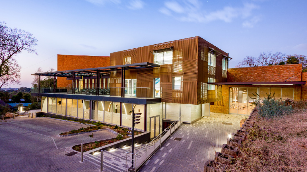
The late morning sun blazes down over the newly transformed Linksfield shul and community center in Johannesburg, South Africa, and architect Asher Marcus is beaming. Because behind his boyish face, wavy hair, and round transparent glasses is a talented young fellow with the vision, who believed in contemporizing the shul of his own youth with a 21st-century design.
The shul, originally built in 1977, is the only shul in the affluent Linksfield suburb of Johannesburg. With a small yet inspired core of frum members, the shul caters largely to those with a strong Jewish identity but who are not yet fully mitzvah-observant.
The shul shares a campus with King David, the country’s largest day school, whose 600 students use the building daily, and on Shabbos it’s used by the multi-faceted community. But was the space and design, built nearly 40 years ago, maximizing its multifaceted use?
Under the creative eye of Asher Marcus, a young yet forward-thinking architect, and the encouragement of Rabbi Levi Avtzon, a Chabad shaliach and senior rabbi at the Linksfield Hebrew Congregation, the shul embarked on a project to reinvent the space and vision for the 21st century. The renewed sanctuary, a brand-new education and youth center, plus a state-of-the-art mikveh, have given fresh energy to this spiritually growing community.
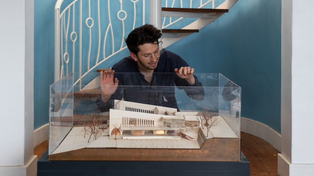
Marcus himself grew up in a traditional Johannesburg home, where he culled a strong Jewish identity. He attended King David Linksfield, the local Jewish day school, whose adjacent shul he’d eventually recreate.
“My brothers got involved in Bnei Akiva, and that was my first introduction to a life of Torah and mitzvos,” he says. “I met some amazing role models, and I also began to find deep meaning in the community and shul. I started going to shul, and my learning developed through that. For me, shul is fundamental, and that’s why I’m so passionate about building communities.”
Marcus eventually became a Bnei Akiva madrich and then spent a year learning in yeshivah in Eretz Yisrael. Ever creative (his mother is a well-known South African artist), he had a vague notion that he wanted to be an architect, “but once I walked the streets of Jerusalem and saw the old structures intertwined with the modern city, I was hooked on architecture,” Marcus relates.
Upon returning to South Africa, he embarked on both a bachelor’s and a master’s degree in the highly-selective architecture track of the University of the Witwatersrand, interned for some big-name architects in Johannesburg, and spent time working in Argentina and Italy, where he spent time visiting ancient Jewish sites and structures.
But for young architects, no matter how talented, it usually takes years before they get to take charge of massive builds from start to finish. For Marcus though, who today heads his own company, Hubo Architecture and Design, a firm that has worked on close to 100 projects worldwide, being in the right place and having a driving vision were the keys to handing him the challenge, age and experience notwithstanding.
Many Portals of Access
While studying architecture, Marcus continued working closely with the Linksfield shul’s youth, but he realized that the shul’s space was not being maximized. “The decor and interior were a bit outdated and not so attractive to the discerning local community, and the youth center was located away from the shul. Shabbos youth programs took place at another location,” Marcus says.
Understanding how space and architecture influence a community, Marcus realized that the vibrant future of the community was tied up to making the youth a priority. Meanwhile, he maintained a long-standing regular Friday morning chavrusa with Rabbi Levi Avtzon, and the two would dream about what the future of the community could be.
“After our learning, we’d discuss what the space could turn into, how we could transform it into something that would really speak to the community,” he says. They realized that the space had more to offer than daily minyanim, Shabbos services, and kiddushes. They wanted to create a living ecosystem of connecting, growth, and learning that spilled out into every area of Jewish life.
“We wanted a community center with a shul, not a shul with a community center,” says Rabbi Avtzon, explaining the nature of the community, which is more like a kiruv community, as not everyone is committed to a strict Torah lifestyle. “Our aim was to offer many portals of access to this space, and the shul is only one of them. We wanted to foster a positive Jewish experience for every person here. We saw that this space could deliver that.”
“I envisioned a safe, modern space, a place for youth to hang out, for mothers to catch up, for fathers to learn in, and for grandparents to attend recreational classes,” Marcus explains. “Rabbi Avtzon asked me to draw something up, although it was an unheard-of undertaking for a new architect with no reputation and not much experience to design something on this scale.”
But with Rabbi Avtzon’s encouragement, Marcus turned to the drawing board.
Home-grown Vision
When a few community members expressed an interest in change in May 2017, Marcus was excited.
“Our intention wasn’t to demolish the existing structure. It was to build on what was there, honoring the tradition and history, and revitalizing it so it would be relevant to the modern-day needs of the community,” he says. “We then took the idea to Ivan and Lynette Saltzman, the founders of pharmaceutical retail giant Dis-Chem. The Saltzmans are incredible philanthropists and community stalwarts. They understood the vision and had the resources to become the driving force behind the project.”
With initial funding secured, now they needed to get the entire community on board.
“Change is scary. The community was apprehensive. This had been their shul for over 40 years. We embarked on a marketing campaign, building 3D models and engaging the community to generate excitement. You can’t force a new structure or building on a community. They need to buy into it and be part of it. It’s their shul, and we had to respect that.”
Soon, though, the vision took on a life of its own.
“People were excited about the possible designs and changes, and a committee was set up to manage the project and find donors. While the Saltzmans were the primary funders, the project was not commissioned by one person but many, becoming a homegrown vision for the shul that developed organically,” Marcus relates.
As part of the commitment to the community, they had a scant six months to complete the first phase so it would be ready for the upcoming Yamim Noraim. The timeline was short, but somehow, by Rosh Hashanah 2018, both campus shuls, hall, kitchen, foyer, and bathrooms were ready.
Work with What You Have
Marcus sees the space as a canvas with unlimited potential and possibility, allowing him to work with preexisting elements of a building, converting it into something modern and refreshing. In the case of the Linksfield shul project, in the first phase, there was no new construction.
“A major key to good transformative design is understanding what you have and how to work with it. In this case, we realized that there was enough space in the existing roof to create a clerestory window that would filter light through and into the foyer.”
By breaking through existing walls in the foyer, the old could transform into the new by itself, without having to be completely reconstructed.
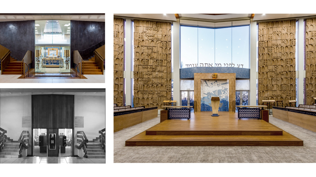
Walking into the shul, one is embraced with warmth, light, and expansiveness. It’s got the cozy ambience of a private lounge, the combination of homely inviting warmth plus spaciousness — it doesn’t feel like the shul holds 700 seats.
The bimah was lowered to allow the community to feel part of the davening and connected to the choir. The bimah was enhanced with laser-cut images representing the 12 Shevatim and the Ten Commandments, both in English and Hebrew, carved into the front wall in a way to appear as if they’re floating. Light streams in from dozens of narrow vertical windows behind the aron kodesh.
While the regular pews were kept, the floors were updated to Jerusalem-like cobblestones and seats reupholstered with luxurious beige fabric. Yet it’s not sterile or stark. It’s embracing and inviting while maintaining beauty and grace.
Marcus is particular about overseeing the finishes, materials, interior decor, furnishing, and artwork. His team’s goal is to stay true to the vision. They take care of every piece of the design, from laying the foundations, to designing the artwork on the walls and curating the furniture and finishings that create the space. He oversees everything as he understands that every item is what contributes to the experience and vibrancy.
“I believe in paying tribute to the history of a community, and we do that by honoring pieces of the structure,” Marcus explains. “We use the space that exists and bring it forward into the modern era. With every design, we tried to make it seem as though it had originally been built that way. We wanted people to feel that it was still the shul they knew, but with something refreshing about it.”
Everyone Welcome
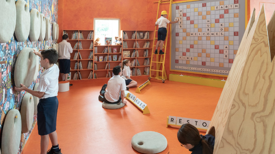
While the youth were previously relegated to off-campus quarters, now the youth center is the first thing you see. The front of the shul now features the “youth box,” a cubical space overlooking the shul’s entrance. It is a recreational area for the shul’s youngsters on Shabbos and throughout the week. It includes beanbags, rooms for shiurim and discussions, and a fully equipped kitchen for shabbatons.
There’s also a toddler and baby room, with toddler-sized play equipment, a mini-climbing wall, beanbags, and changing areas which leads onto an open-air terrace. And it’s strategically located a few steps away from the women’s gallery.
“We want to include and welcome everyone, and the way you do that is to cater to their needs and allow them to participate in the way that makes sense to them,” Marcus says.
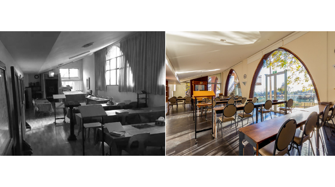
Marcus explains that it’s the detail that ties together new and old. “Our addition of a lecture venue and terrace to the existing shul’s archways and spaces was done with a very particular mechanism of a glazed link. A crack that runs between new and old. It’s the detailed element that lets light in as it lifts above the archways, liberating them and creating an intense spatial experience. It became a visual link between the terrace and the ground floor — the continuation of old lines from the windows of the old synagogue as they burst into new views and vistas.”
Marcus feels proud of how they managed to transform the new community center without any new construction.
“The existing archways on the façade were cluttered with drywall, brick, and prefab steel. We looked to liberate these archways. Now, there is a floating door frame within a magnificent glass archway. The steel edge is a space for lighting. The beautiful brick edge is revealed as a trim to the surroundings of the arch. They have become beautiful frames from outside to inside on the eastern facade. On the Western facade, these become internal archways. It’s a street scene out of modern-day Jerusalem.”
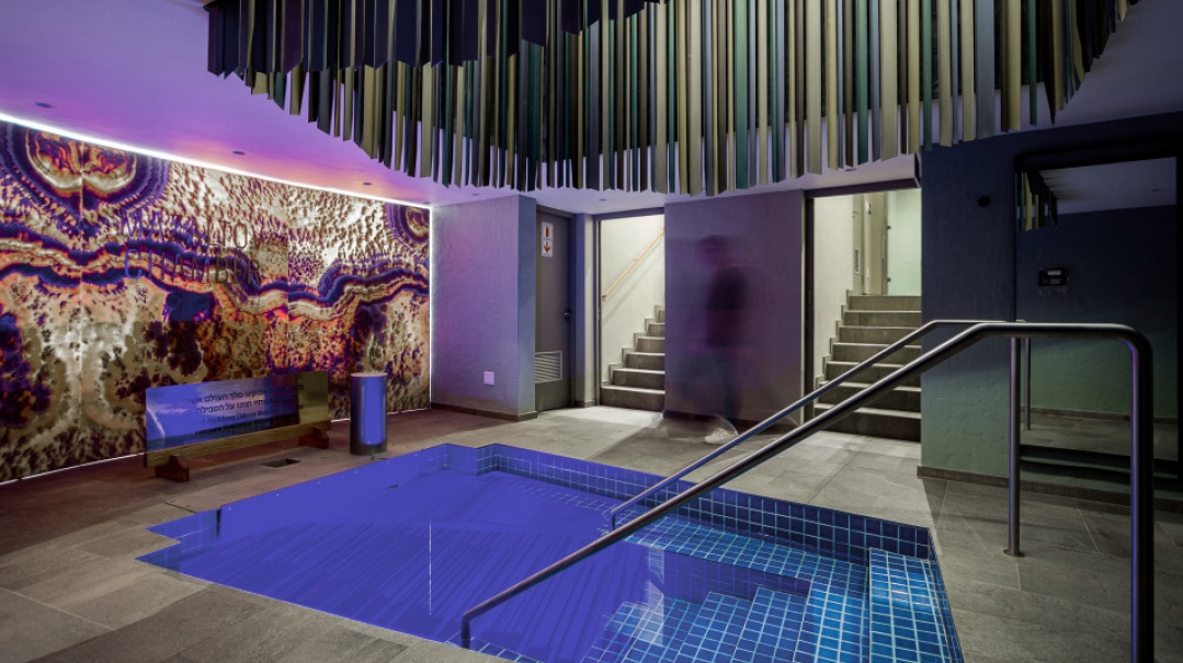
Marcus’s biggest challenge was designing a mikveh from scratch. Having never built one before, he embarked on an intense learning process.
“I began a weekly chavrusa with Rael Smith, a frum local civil engineer, so I could understand the intricate halachos. While being design-centric, the first priority was to fulfill the highest halachic standards. World authority on mikvaos Rabbi Meir Posen flew out to supervise and make sure it was mehudar.”
The mikveh, sponsored by Dan and Melanie Saltzman, is built entirely underground, the design inspired by ancient mikvaos which were all down a flight of stairs.
Translate the Dream
A child of the millennials, Marcus relies heavily on technology and is a passionate advocator for it. “Once we get the basic designs or dimensions into our programs, the creativity starts. We see it as a playground and begin playing with options. The quicker you get at using the technology, the more you can do.
“We then start experimenting with different structures, openings, concealed walls, and light options. Admittedly, the process is a bit scary. Will we come out with something that is beautiful and magical?”
Finally, he completes his vision as 3D rendering, a lifelike presentation of what is possible.
While Marcus follows contemporary design principles, focusing on light, space, and clean lines, what’s most important is to be able to accurately translate the client’s vision. For example, he’s currently renovating a smaller, more conservative shtibel of Rabbi Dov Tanzer. While reminiscent of the yeshivos of Europe with rows of tables and chairs, it is also embraced with natural light and warmth, sprinkled with a touch of modernity without sacrificing the classical environment.
Before any project begins, Marcus spends hours listening to the people who have commissioned the space, understanding who they are, their feelings, and what they want to achieve.
“It’s not about art or being modern for its own sake. It’s about using design and interior architecture and decor elements to create an experience which invites connection and growth — in whatever it means for the people using the space,” Marcus affirms.
“In years past,” he continues, “many architects tried to make shuls look and feel like churches. They wanted the light to be only from the top. It gave a heaviness and gravitas to the space, but it didn’t make for inviting spaces. I prefer to use horizontal light so a shul can be airy, close to nature and full of light — more delicate, more like the Mishkan, accommodating our many relationships with Hashem. The move toward the shtibel has also changed how we experience a shul. People are no longer looking for a concert hall. They want engaging spaces, with tables and chairs and spaces for learning.”
And he says the most rewarding part of his flagship project — the Linksfield shul — is seeing the newly-created spaces being used. “When I come for a Shabbos and see the kids relaxing on the couches and the moms and children playing on the terrace outside, while a shiur is going on in the small shul — all this in a frum Jewish atmosphere, wherever they individually may be holding — that’s the goal. It’s about the energy and the connection that creative design can facilitate.”
(Originally featured in Mishpacha, Issue 860)
Oops! We could not locate your form.

