Extra, Extra

When Yom Tov comes, that means special projects. A look at the processes behind 20 of these special products
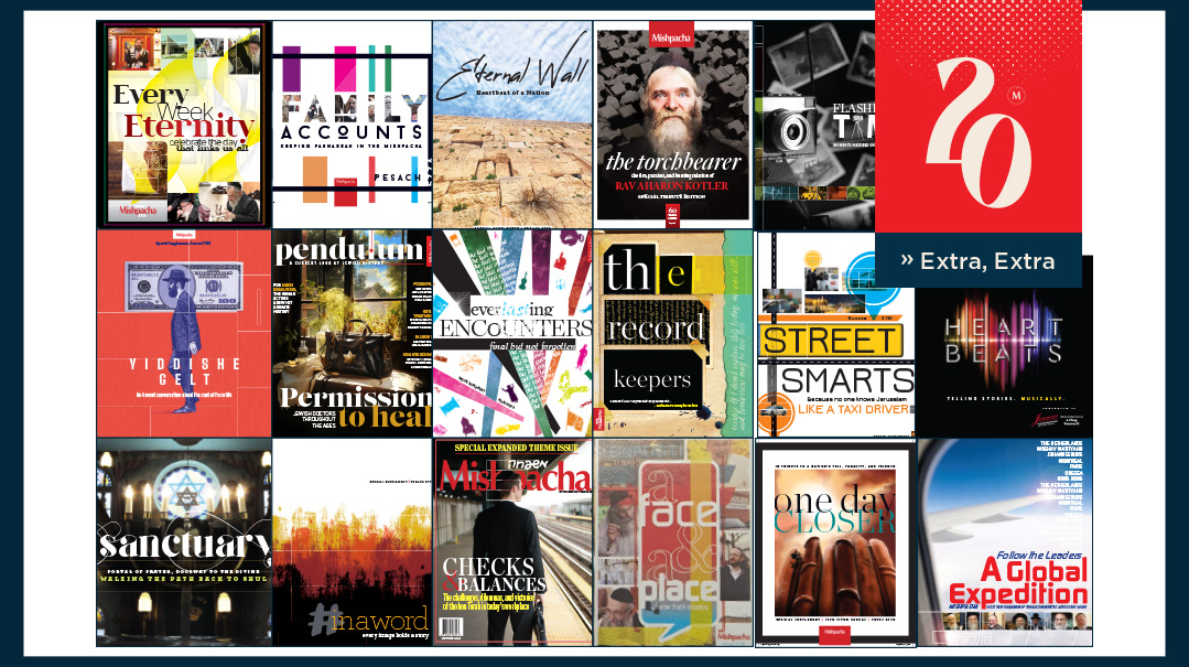
Many years ago, when Mishpacha’s original editorial team met to plan a Yom Tov magazine, visionary editor-in-chief Rabbi Moshe Grylak ztz”l leaned forward in his chair. His blue eyes glinting with youthful creativity, he issued a challenge: “Why don’t you do something different? Something fresh. A project, a collection of articles about a single topic — maybe on Jewish kingdoms of the ancient world?”
That challenge spawned a whole new concept for Mishpacha. Since that brainstorming session, virtually every Yom Tov lineup includes some sort of creative “project” — a highly invested collection of pieces revolving around a single theme.
Over the years, some of those projects were lighthearted, like the visits to friendly family grocery stores around the world. Others were serious and thoughtful, like the supplement of “lasts” — the last yeshivah to operate before the Holocaust, the last Jew to leave Gush Katif, the last cassette tape to be produced on the Jewish music scene.
The formats also varied. Our “Street Beat” project touring major frum thoroughfares appeared inside the main magazine; our collected profiles of prominent father-son pairs filled a stand-alone supplement.
When discussing a Yom Tov project with our art team, the basic instructions are always the same: within the basic Mishpacha visual framework, this should feel like its own “briyah,” its own creation. It should have its own unique vibe and look, with visual elements that reflect the particular theme and mood of the project.
To pull that off, our team explores new fonts and different photography styles. New visual templates are built, and the graphic artists are encouraged to work with different color palettes. Yes, the read should feel like a Mishpacha experience — but it should also broadcast that directive that animated Rabbi Grylak so many years back: Let’s do something different!
Follow the Leaders
Succos 5770
The very first standalone theme supplement appeared in the Succos edition of 5770. It was a bold step — and almost a crazy one, from a logistical perspective.
The concept: Dispatch seven writers to seven different communities, and ask them to bring back a colorful, detailed picture of the community along with its rav. We wanted to watch the rabbanim in action, hear about their unique challenges and accomplishments — and along with that, to convey the flavor of their location.
This type of project should take months to coordinate, but we were newbies, and we gave ourselves about three weeks. (We clearly didn’t know what we were getting into.) Thanks to our hardworking writers, production, editorial, proofreading, and graphic teams, come Succos, readers were treated to an armchair traveling experience to Hong Kong, Amsterdam, and Paris, among other locations — along with an intimate look at their frum communities and leaders.
And we realized we’d set a bar that we would have to meet next Yom Tov.
A Father to Follow
Pesach 5771
Pesach is the Yom Tov of mesorah, and it was only fitting that we present our readers with a collection of joint portraits of notable father-son pairs. The design for these pieces utilized overlapping geometric shapes and gently-shaded silhouettes of a father interacting with a child, but the main visual pull was the vibrant full-page photos of the subjects together — and the archive photos they kindly provided from their childhood albums.
When we planned the project, we wondered — should we seek out sons who occupy the same posts as their fathers, or should we intentionally find sons who have found different paths? For the most part we took the second route, and found affirmation in a quote from Rabbi Raphael Pelcovitz, one of the featured fathers: “There is never an expectation that a [Jewish] son will be everything the father is; our emphasis is on the transmission of values, not vocations.”
Among the hundreds of photos we gathered, there was one photo we kept coming back to: a shot taken from behind of Rabbi Yisrael Meir Lau walking alongside his youngest son, Rav Tzvi Yehuda. Rav Lau’s hand is on his son’s shoulder — to lend guidance or to receive support, we weren’t sure. But we did know that with its silent message of connection and warmth, this was the perfect cover photo for the supplement.
A Face & a Place
Succos 5772
The concept for this supplement came to life during a brainstorming session. “You know those people whose identity is linked to a certain place?” an editor suggested. “Like, as soon as you hear the name ‘Moishe Metzger’ you think of Shomrei Shabbos in Boro Park. Why don’t we do a project about people who have become synonymous with places?”
The final product was called “A Face & A Place,” and it featured an international roundup of characters who are instinctively affiliated with a specific spot. Antwerp’s Kleinblatt Bakery, Melbourne’s Golds World of Judaica, Baltimore’s Seven-Mile Market — all bring to mind a single face whose life has become inextricably linked to the venue. This supplement explored those links, taking readers along for the ride and sharing the inspiring stories behind the legendary faces.
Between the Lines
Pesach 5772
In the age of digital communication, there’s something evocative about a handwritten letter. This Pesach project featured the dramatic stories encapsulated in different letters: the letters that kept a group of Novardoker bochurim connected through the vicissitudes of life, the deceptively sanguine letters sent by concentration camp inmates to their families, the letters sent by an idealistic Jew to a prison “pen pal.”
The supplement was designed with soft ink blots in the margins and the silhouette of a quill used as a background accent. Our design team found a dramatic gothic font that seemed like a perfect fit — but we realized it would be too hard to read in large blocks of text. So each title and intro has one or two words in that decorative font, maintaining the intense effect while keeping the text clear and easy to read.
Flashes in Time
Pesach 5773
They say a photo is worth a thousand words. But some famous photos hold stories that can unfold across many pages. This supplement aimed to unearth the stories behind photos that we’ve all seen — the little boy facing the Nazis with his hands raised, the terrified child watching his father get chased during the Crown Heights riots, the redheaded frum guy racing from the about-to-implode Twin Towers.
After doing the legwork for many, many photos, we narrowed down the list to the ones whose subjects we could realistically track down. Then we tasked our writers to share the before, during, and after of these inadvertently famous Jews’ moment in the spotlight.
Our creative team, headed by art director Menachem Weinreb, went all out with the visuals. They printed out the photos in black and white, put them in matching frames, and hung them from the branches of a tree for a striking sun-dappled visual. The titles of the articles were hand-lettered in all caps by Menachem, back before handwriting fonts were the latest vogue — each title had to be written, then scanned, then incorporated onto the page. The final result was, as we’d hoped, a “different briyah” — a product that felt fresh, novel, and memorable.
Every Week Eternity
Succos 5775
A supplement celebrating Shabbos — what could be more universal? But how do you break down such a big, encompassing topic into actual magazine material?
The first method was asking several writers to spend Shabbos with a recognized gadol or in a venerated institution, and to share the experience with our readers. Now our readers would know about Rav Chaim Kanievsky’s zemiros, or the homemade pickles prepared by Rav Yitzchak Yosef’s wife, or about the Skverer Rebbe’s Shabbos routine.
Then we asked various public figures to describe the place they never thought they’d spend Shabbos — yet somehow ended up doing just that. We curated several personal experiences from readers who struggled and prevailed to keep Shabbos. And we collected Shabbos takeout trends from around the world too.
We also challenged our writers to describe Shabbos in just seven words. Those pithy descriptions were placed in the margins throughout the supplement, pulling readers along on the weekly journey to eternity.
Everlasting Encounters
Pesach 5775
This supplement was unofficially called “The Last Supplement” in our office — not because it was the last project we ever wanted to do (although that might have been the case by the time we reached the finish line), but because it explored a collection of Jewish “lasts.” To reflect that serious, “final” tone, our team used a thin font with a spidery feel and a limited color palette. Each piece was introduced by a tagline using the word “last” — the last stand, the last night, the last volume, the last request.
The final piece was a contribution by Reb Sholom Mordechai Rubashkin, who was then in prison, envisioning his last day in jail. It was titled, “Ready for Redemption” and in it, Reb Sholom Mordechai promised, “I will, b’ezras Hashem, hold tightly to my sefer Chovos Halevavos, which stayed with me through all the different levels of Gehinnom, and carry it close as I walk out, free.”
The Record Keepers
Succos 5776
Back in school, we learned about the value of primary sources in recording history. For this project, we tracked down a selection of diaries and asked our writers to fill in the stories of their writers.
The resulting collection was varied — it included a manuscript of famed partisan and mohel Reb Romi Cohen, a 16th-century memoir kept by a secret Jew trying to escape the Inquisition, a modern-day blog recorded by the father of a desperately ill baby girl, and the shriveled diary of astronaut Ilan Ramon.
We knew we wanted a handwriting font for this project, but most handwriting fonts have a feminine feel, and the narrators of our diaries were male. We went through option after option. Finally, our art director found a strong, bold font with just enough quirks and irregularities to look authentic — but when we put it on the page, the words looked impossibly cramped. The solution: keep the font, but open up the spacing between the letters. It’s become a favored Mishpacha font, and if you look carefully, you’ll find it used in the magazine every now and then when a piece needs that special “recorded from the heart” look.
Family Accounts
Pesach 5776
For Pesach of 5776, we decided to pursue a subject with a light and current vibe. We asked our writers to find family businesses that had been operating for at least three generations, and to invite our readers into these establishments to hear about their inner workings.
The resulting articles were fascinating explorations of both the human interactions between generations, and the myriad considerations and calculations (and hidden tzedakah and chesed) behind every Jewish business. And the photos — spread over entire pages or even occasional spreads — felt almost like a documentary.
From the Crown Heights fish store to the Viennese furriers to the Meah Shearim hatters to the Baltimore cattle farmers to the legendary Jerusalem butchers — each “family account” was a visual and textual portrait worth reading and rereading.
Heartbeats
Succos 5777
“Heartbeats” was the name we gave to a special Succos project that finally solved the frustration of readers who loved reading our features about music — but found themselves stymied when they didn’t know the songs being described. This project combined a CD with a collection of articles providing the background of the songs.
The design merged photos of dancing chassidim and Meah Shearim alleys with a visual motif meant to mimic the look of the volume control on those long-ago tape recorders. It was a bold fusion of timeless and modern — but much like the music it highlighted, it all came together in the most satisfying way. The final product was a feast for the eyes, minds, and ears.
Sanctuary
Pesach 5778
When we planned a supplement celebrating our personal connection to our shuls, we asked our production department to check whether we could print it in a different format. We dreamed of a supplement that would feel like an album. Fortunately, the paper was available, and in this achingly nostalgic project featuring reminiscences about the “shul of my youth,” we were able to include rich photography, layered backgrounds, and shul-inspired icons on virtually every spread.
So many people wrote in, inspired by the memories of that baal koreh, this nusach, the whiff of whiskey or the fraying carpet in the lobby, that the supplement spilled over into a steady magazine column, where guest writers shared their own memories of the shuls where they learned the ancient-yet-current Jewish craft of spilling out your heart in prayer.
Checks & Balances
Special theme edition, Magazine Issue 750
Magazine Issue 750 was a departure from the usual Mishpacha mix of topics and tones. It was an expanded theme issue, in which the entire feature section of the magazine explored a single topic: the transition of the ben Torah from full-time learning to the modern workplace.
This project provided hashkafic perspective, practical guidance, and personal accounts. We were privileged to feature the guidance of several prominent rabbanim and leaders as well.
To give all that material a unified look, we commissioned a special photo shoot, asking our photographer to follow a working frum man through every stage of his day — from his morning commute to his desk, from meetings with coworkers to the daily daf. Those photos appeared throughout the project, pulling it all together in a tangible way.
In a Word
Pesach 5779
Even magazine editors get bored. After so many Yom Tov projects, we were itching to do something different, and so we decided to invert our usual methodology. Instead of creating beautiful, moving text and then finding visuals to match, why not start with the visuals?
We came up with seven words — words like “handiwork,” “triumph,” “sacrifice,” and “connected” — and asked our contacts, what image comes to mind when you hear this word? Which photo from your personal album encompasses its meaning? Send us the photo, and explain how it encapsulates this concept.
The resulting project was creative, arresting, and profoundly moving. In some cases, it was very challenging to pull words out of people (such as our photography team) who think in images. But the collaboration between the “text people” and the “visual people” created something much greater than either part.
One Day Closer
Siyum HaShas 5780
Just before the Siyum HaShas, Mishpacha produced a supplement over 100 pages long, celebrating Klal Yisrael’s upcoming milestone in full color. Our writers hunted down original material about Daf Yomi founder Rav Meir Shapiro, introduced several pairs of noteworthy chavrusas, and spoke to the team at ArtScroll who gave so many learners entrée to Gemara.
But the underlying celebration wasn’t only about Gemara. It was about the grit and resilience of the Jewish people, who take on massive, seemingly distant goals and make them reality by breaking them into small, approachable steps. So we included other material too: accounts of people describing how they almost gave up on Daf Yomi but kept going, and stories of people who took small but consistent steps toward other worthy spiritual goals.
The title of the supplement was “One Day Closer,” and the image that carried it was the silhouette of a determined climber, slowly but steadily climbing an intimidating mountain range — that at closer look proves to be the six sedorim of Shas.
Street Smarts
Succos 5781
Succos in Jerusalem is usually the Yom Tov of tourists, when so many visitors thrill at the opportunity to walk to the Kosel with arba minim aloft, or to dance at yet another sweepingly joyful Simchas Beis Hashoeivah. But Covid snatched that opportunity away. We wanted to give our readers a sense of Yerushalayim, even from afar. And what better way than to feature its legendary taxi drivers?
We collected our writers’ “top taxi tales” and asked a roundtable of drivers for their expert opinions, tips, and advice. Then we asked three taxi drivers to treat our writers to personal tours of the city they know like the back of their hands. As they circled the streets, pointing out landmarks and sharing memories, the drivers shared their love for the Holy City and its people. It was a ride that we all savored as we waited for the skies to open and for the taxis to fill up once again.
Yiddishe Gelt
Succos 5782
The “Yiddishe Gelt” supplement — a serious, thought-provoking look at the financial pressures and problems, solutions and triumphs of frum families — was a major departure for us. We see Yom Tov as a time to focus on our blessings, not to decry a crisis. So it was with some trepidation that we finally actualized the plans that had been on our back burner for so long.
The supplement included stories of typical frum families that had pulled out of debt, advice and perspective. And perhaps most fascinating was a feature called “Price Check” that simply recorded the prices paid by people in different socioeconomic groups and locations for the same frum fundamentals. Sometimes simple, unvarnished data is the most enlightening of all.
Eternal Wall
Pesach 5782
The “Eternal Wall” supplement documenting the people and unknown corners of the Kosel almost didn’t happen. We pitched Mishpacha photographer Eli Cobin a different idea (which may still happen in the future). He liked it, but then threw a suggestion back at us: “You know, I’m always at the Kosel — early in the morning, Friday when my wife doesn’t go to the office, after a hard day… why don’t I hang out there for the next month or so and bring you a collection of photos? Then I’ll set up your writers with the subjects, and we can tell their stories.”
The logistics weren’t quite that simple — some of his subjects weren’t interested in magazine write-ups, and some of the important characters of the Kosel weren’t there when he was — but after utilizing multiple resources and working to the last possible minute, we built a project that conveyed the breathtaking visual appeal of an album along with the magnetism of strong human-interest writing.
The kvittel motif — a crumpled paper — was the perfect finishing touch, placed judiciously behind titles and teasers, to bring it all home.
Torchbearer
Chanukah 5783
The meticulously researched and beautifully written pieces by Dovi Safier and Yehuda Geberer are a valuable contribution to the magazine and eagerly anticipated with every Yom Tov edition. But in honor of the 60th yahrtzeit of Rav Aharon Kotler, they decided to aim even higher and, along with several other writers, produce a full-length standalone supplement telling many unknown details about America’s Torah torchbearer.
Along with its expanded text, the project was chockful of rare archived documents and photos, newspaper articles from the early days of Beth Medrash Govoha, and even the most faithful talmidim discovered new information in its pages. It’s not every Chanukah that we include a supplement in the package, but this felt like the most valuable gift we could give our readers.
Pendulum
Succos 5784
Conventional wisdom used to be that history is a niche interest limited to a small, academic slice of the readership. But over the years, we’ve noticed that conventional wisdom is no longer true (was it ever?). The current fascination with Jewish history has swept up readers of all ages, stripes, and types.
In the “Pendulum” supplement, we aimed to provide those readers with a standalone magazine that delivered quality, reliable historical content in the trademark Mishpacha style: with engaging writing, a variety of creative formats, and compelling visual presentation.
It’s challenging to find visuals for subjects who lived hundreds of years before cameras existed. To achieve that historical flavor, we worked with a program that mimics the painting style of old Dutch masters. And we searched hard until we found a font that conveyed the weight of history without looking cumbersome or antiquated — something that silently broadcasted “current take on history.”
Calligraphy Fiction Supplement
Almost from the very beginning of Mishpacha’s history, Yom Tov editions came with an expanded fiction selection. After all, there’s no time like a Chol Hamoed evening to get lost in the drama, conflict, and dreams of a fictional set of characters.
With time, the “look” of the Calligraphy fiction supplement evolved. We now print it on specially-sized paper, with a full title page for each selection. We also format the stories in single columns rather than the typical magazine-style multiple columns per page — which fosters a different pace and focus. Now, when you curl up with Calligraphy, you feel almost as if you’re diving into a really good book.
(Originally featured in Mishpacha, Issue 1008)
Oops! We could not locate your form.
