When going to a big-box store and looking to purchase art, it can be hard to know what’s worth bringing home and what’s best leaving in the store. To eliminate some of that overwhelm, Chanie and I met virtually at HomeGoods. She presented me with different options of art, and we discussed why the item should be left or why it should be brought home. In this article, you’ll see the items Chanie found and photographed on her phone in real time, as well as tips on how to navigate this process on your own.
Love it. Leave it.
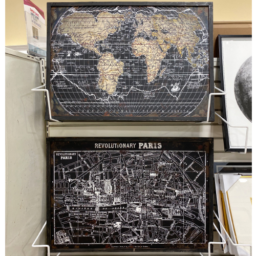
This captivating world map would look great in a boy's room, playing into a child's curiosity, but with timeless style. Leave the bottom one because it says “Revolutionary Paris,” and I’m not so keen on having connotations of war in a bedroom.
Note: When getting a piece of art, especially from big-box stores, it’s important to make sure that you feel comfortable with what it represents.
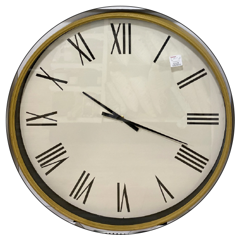
Love it.
The simple elegance of this clock would work well in a kitchen nook, providing form and functionality.
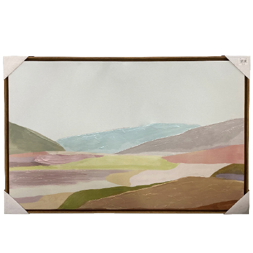
Leave it.
The brown tones mixed with the pastel colors don’t look great together, and the rudimentary shapes of the mountain feel unsophisticated.
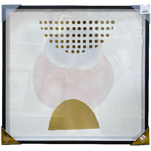
Love it.
Placed next to other pieces of art or photos, this piece would shine in a girl’s room with similar tones. When curating a gallery wall, look for a few playful, nondescript pieces to balance out the impactful, heavier ones.
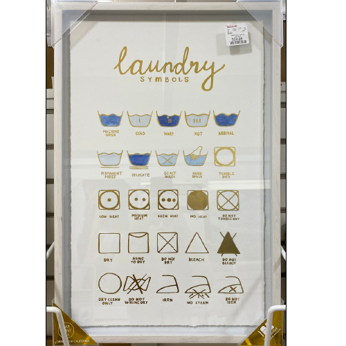
Love it.
This is super adorable for a laundry room or area. H&M has a laundry poster right now, and this one is ten times cuter.
Leave it.
With its timeless palette and lack of focal point, this piece falls flat.
Love it.
I found this piece to be interesting because when it was right side up, it looked like an abstract man without a neck, but when switched upside down, it still worked! Sometimes playing around with the direction of the art ends up yielding the most unique result.
Love it.
This trendy piece is perfect placed within a gallery. Consider injecting small pieces that are trendy, instead of focusing an entire room or large art piece on today’s design aesthetic.
Leave it.
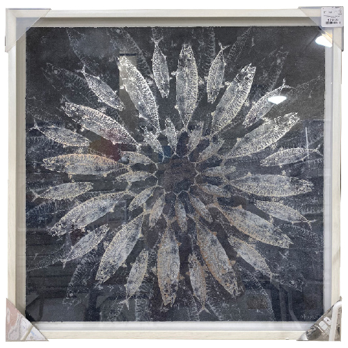
If you weren’t sure right away… it’s fish shaped like a flower.
Leave it.
The saturated colors are too bold for a painting with such a traditional subject. If this palette was painted pop art style, I would most likely grab it, but a traditional design and these colors don’t work well together.
Leave it.
Although art is seeing an increase in bold colors, here the colors are muted by the light blue background.
Leave ´em.
Both these pieces of art are generic and simple. They would take up prime real estate on the walls.
Leave it.
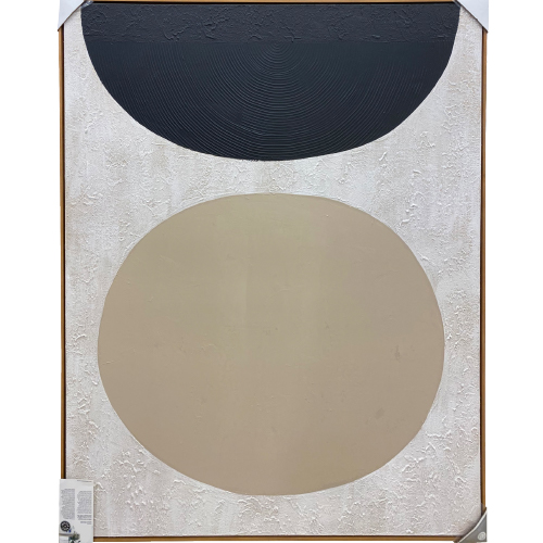
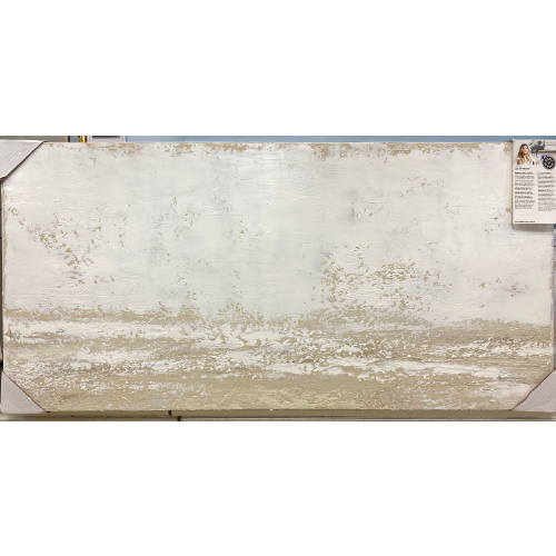
This piece does not achieve the minimalistic impact modern art aims for. Instead, it feels basic and forgettable.
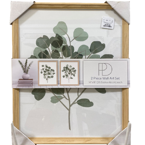
Love it.
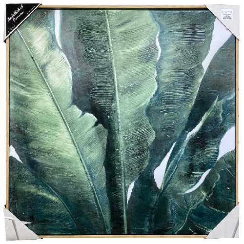
At just $30, this is actually a two-piece set. The coloring is nice and warm, the art is done well. It would look great in a powder room.
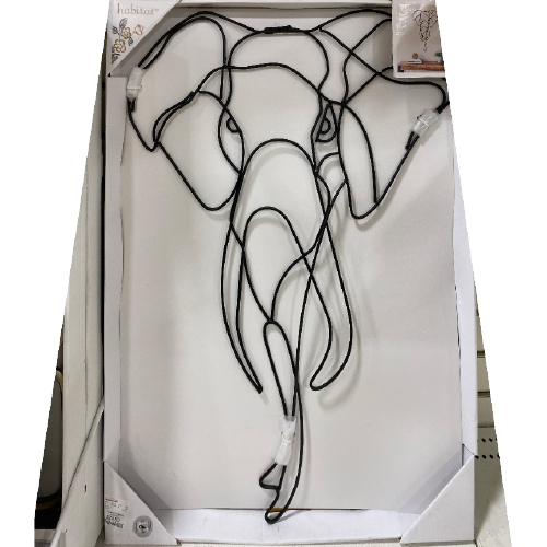
Leave it.
The wiring makes the mood feel heavy.
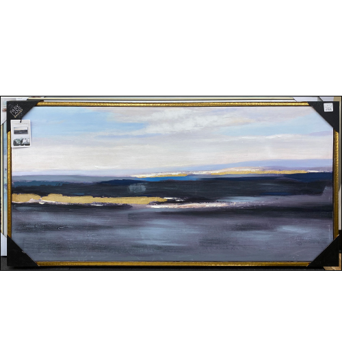
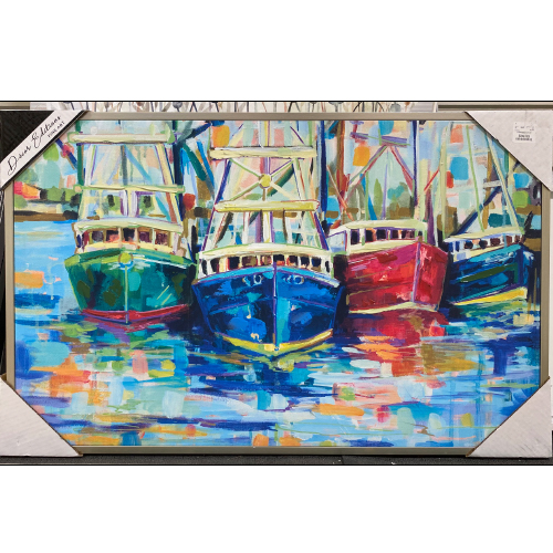
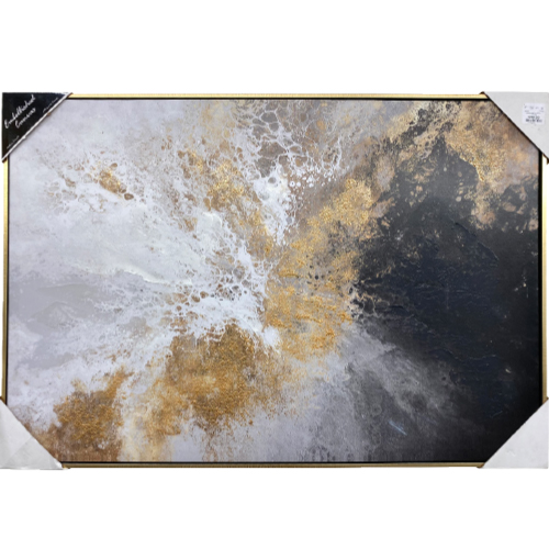
Love it.
This abstract piece has a dramatic palette and movement, and would work well in a formal space like a dining or living room.
When perusing artwork where there’s a ton of variety, ask yourself how the coloring feels to you, what kind of shape you need, and if the art piece has meaning. As a rule, look for art that feels unique and different. Art pieces that just fill up a space end up feeling blah and unsophisticated. Look for pieces that will bring you joy, create good conversation, and present a whole mood.
In her spare time, Miri Lichtman is an interior decorator with an emphasis on affordable yet unique design. You can find her sharing inspirational photos, room mood boards, and sources for decor at mirilichtman.com.